 Viktoriia Shakhnir
Landing Page for the Platform
A conversion-focused landing page for an EdTech platform targeting mentors
Open prototype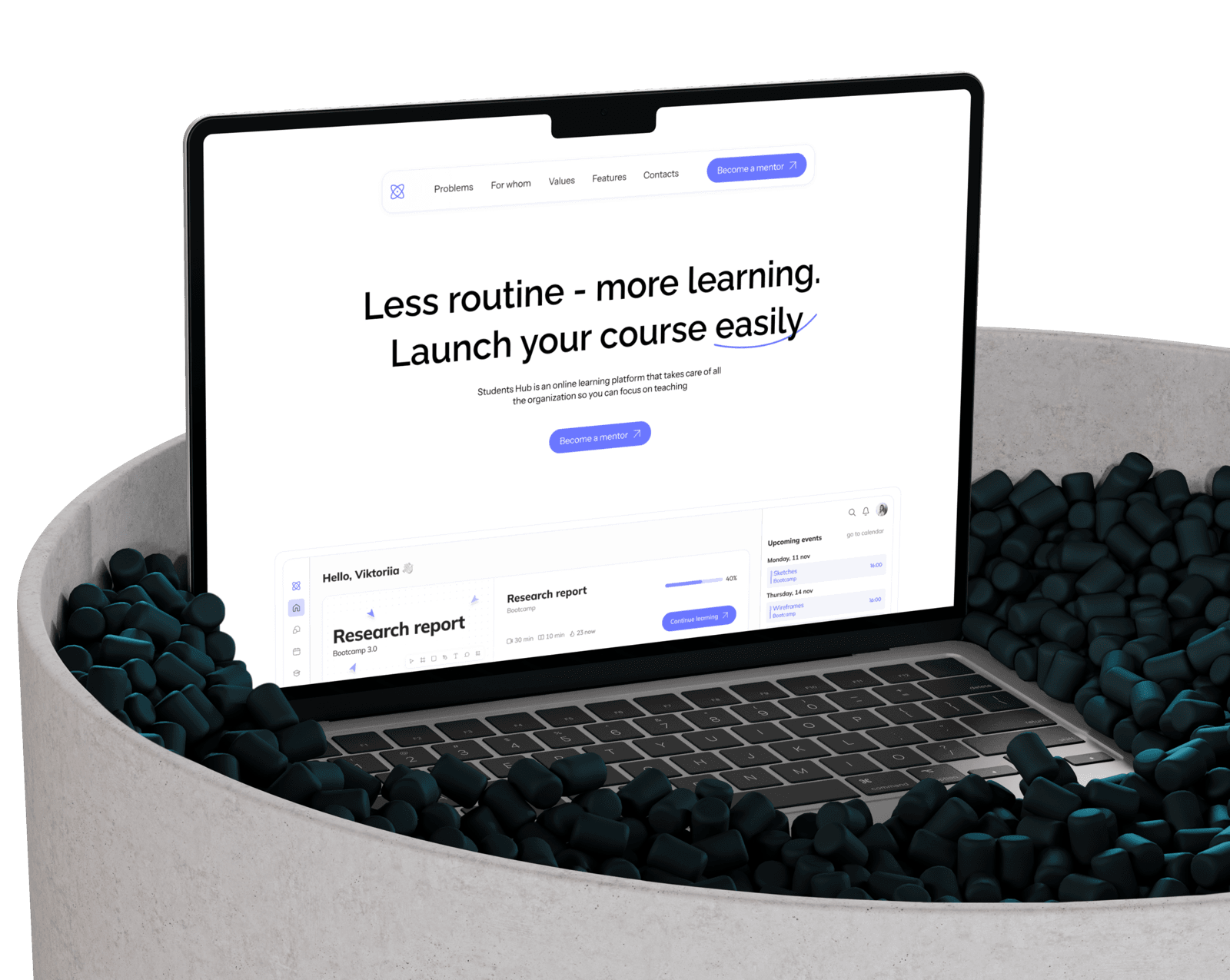
Overview
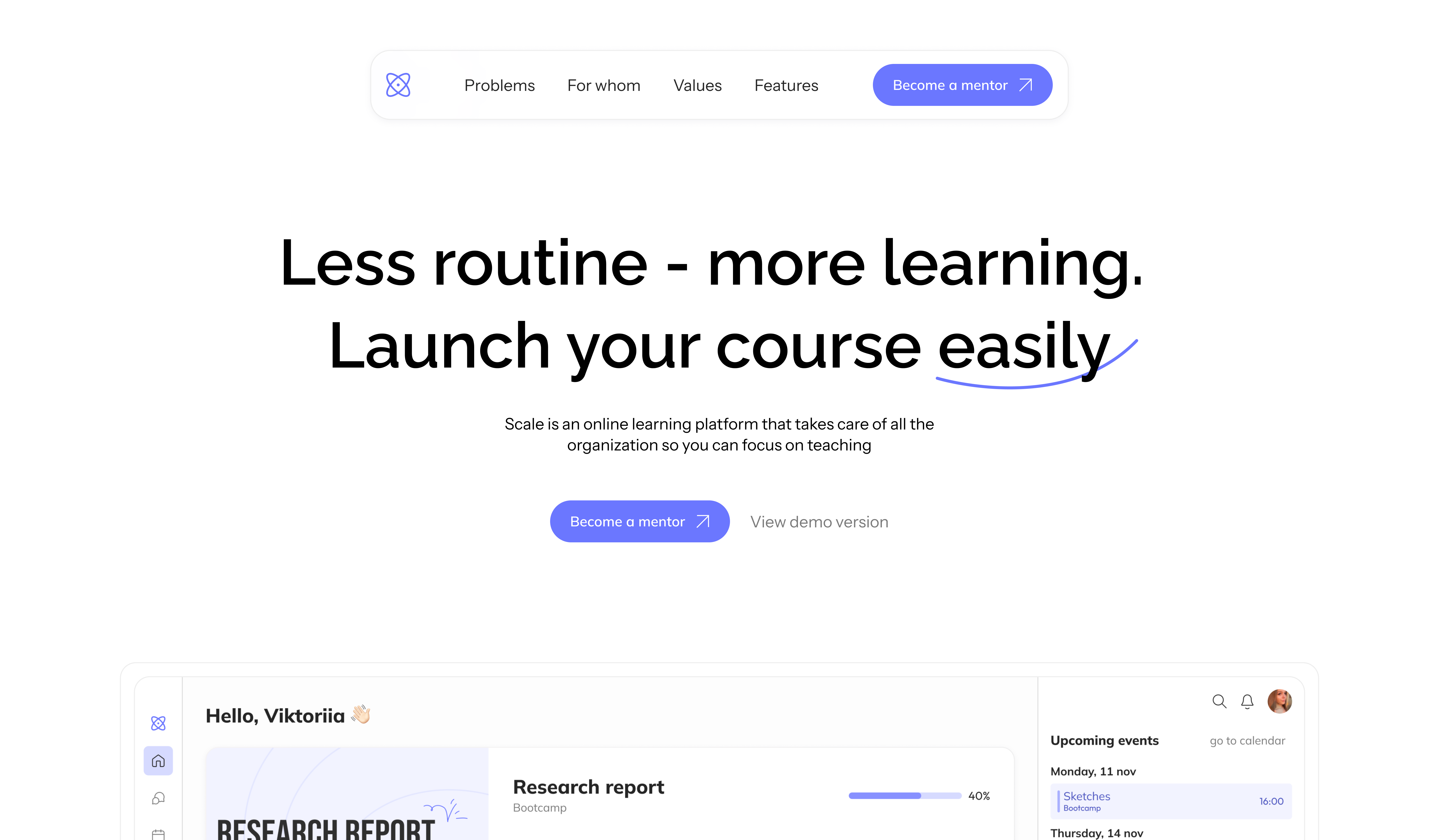
A landing page designed for the Students Hub online learning platform, with mentors as the primary audience: online instructors, tutors, bloggers, and teachers looking for a modern tool to work with students.
The goal was to communicate the platform's value clearly enough that a mentor understands within seconds how it will simplify their work and make learning more comfortable for students - with better engagement and stronger outcomes.
- 1
Discovery
Defined the target mentor audience and identified what needs to be shown to engage each type
- 2
Moodboard
Gathered visual references from tech products and startups to find a style beyond typical EdTech templates
- 3
AIDA structure
Built the page structure around the AIDA marketing model for a logical and persuasive user journey
- 4
UI Design
Designed a minimalist UI with smooth animations for both desktop and mobile
Moodboard
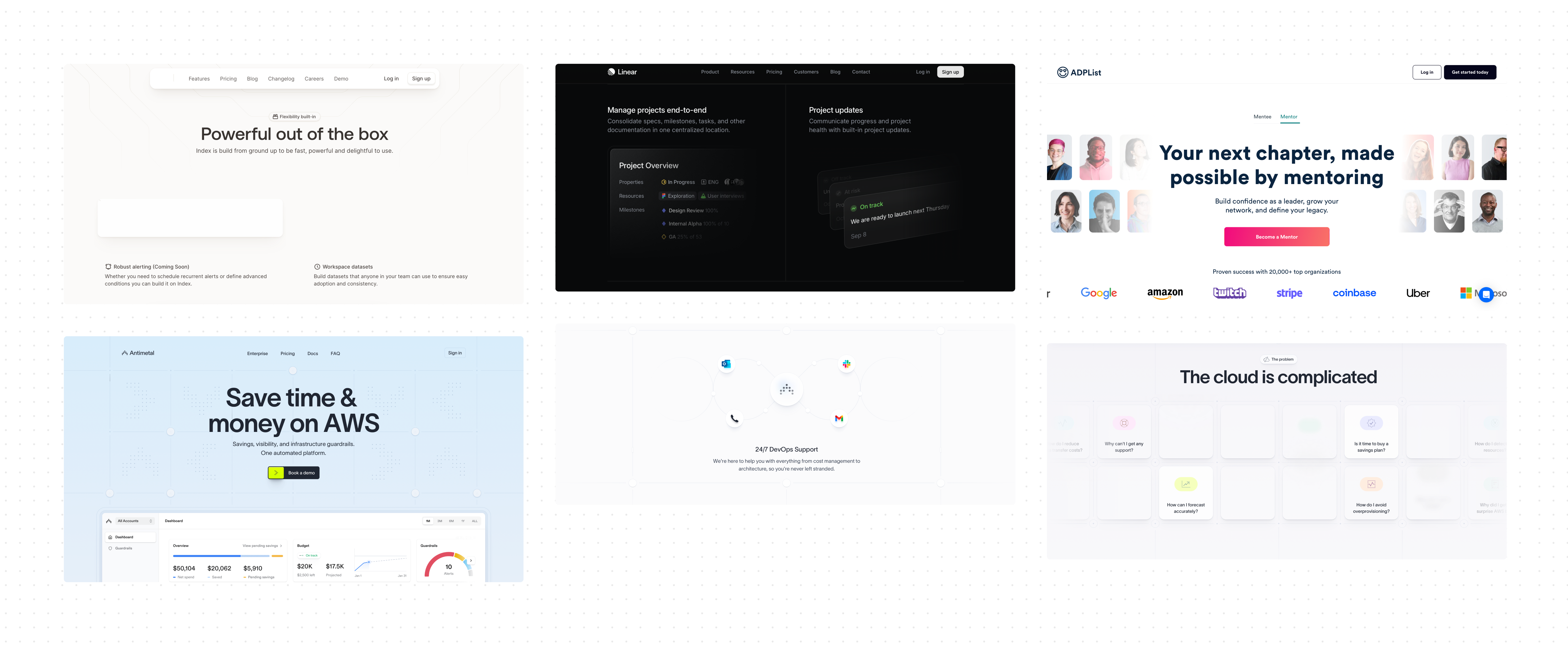
When building the moodboard, I looked beyond educational platforms. The goal was to find a fresh, modern visual style - so I researched design from tech product sites, startup landing pages, and creative service websites.
Page Structure
The page structure follows the AIDA model (Attention - Interest - Desire - Action): each section logically moves the mentor toward the next step, from first impression to submitting a request.
Hero section
A clean, modern first screen with the platform interface immediately visible - mentors understand the product within seconds.
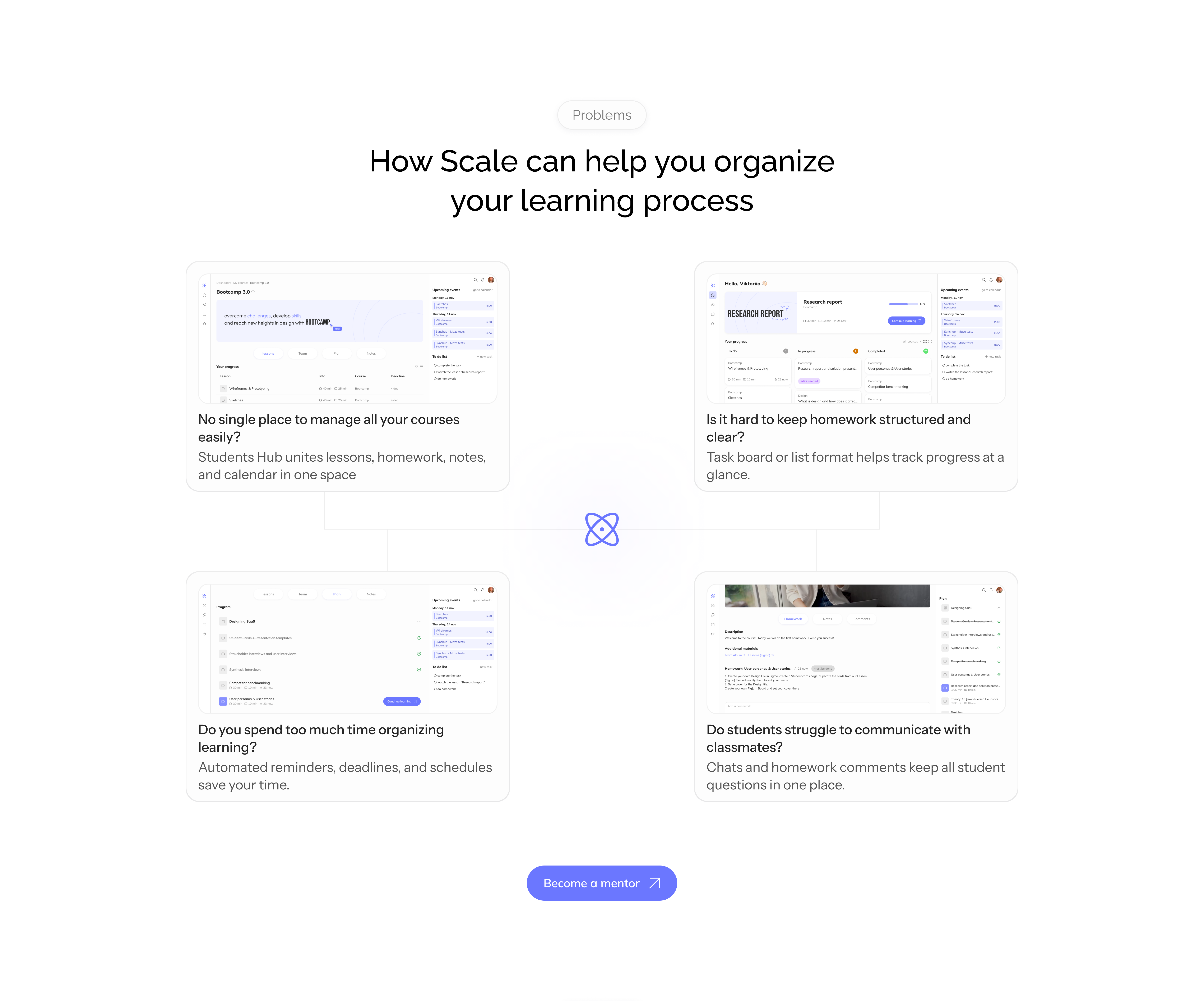
Problems and solutions
Core mentor pain points alongside how the platform addresses each one. The section is laid out as a closed diagram with the logo at the center - symbolizing the platform as the answer. Animation adds engagement.
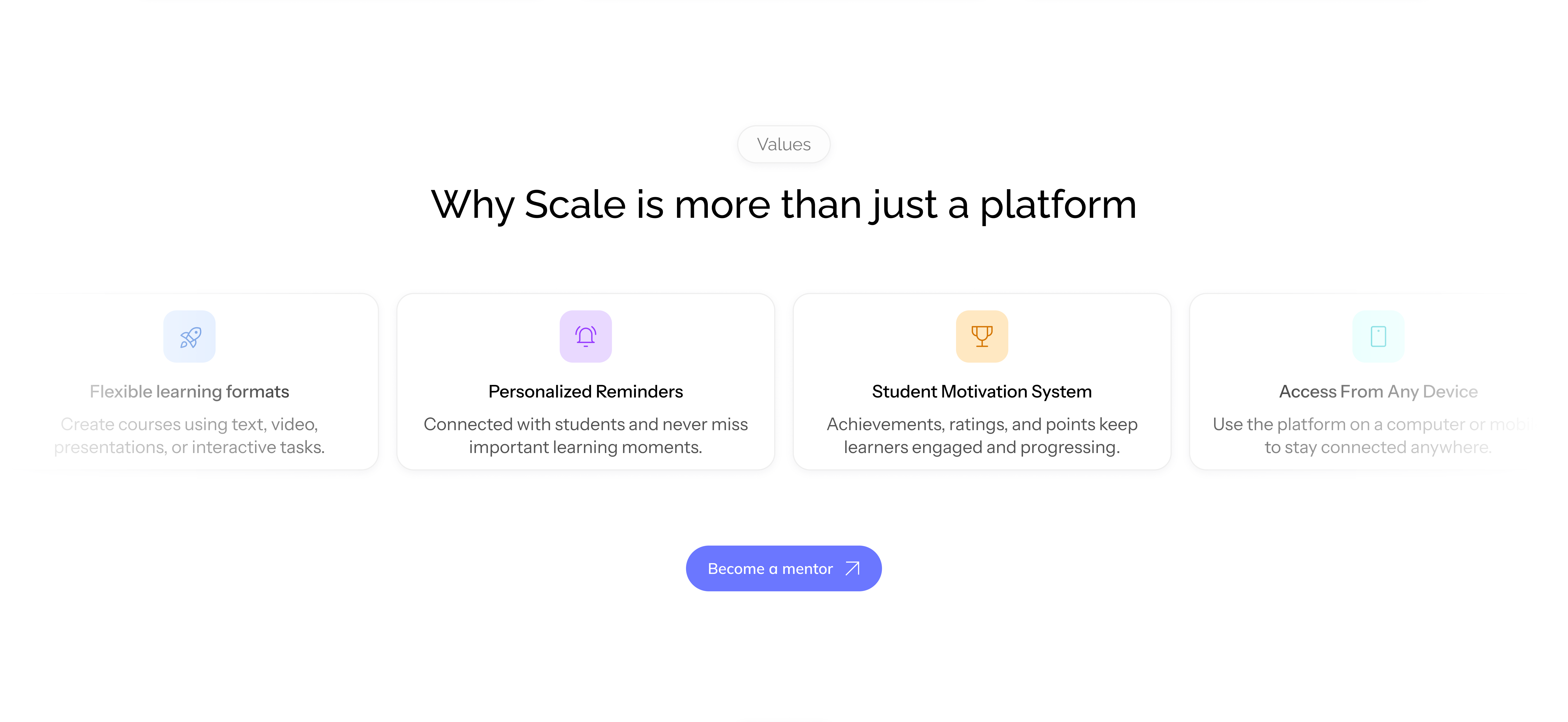
Platform values
Key advantages displayed with an infinite scroll animation: more content without overloading the page.
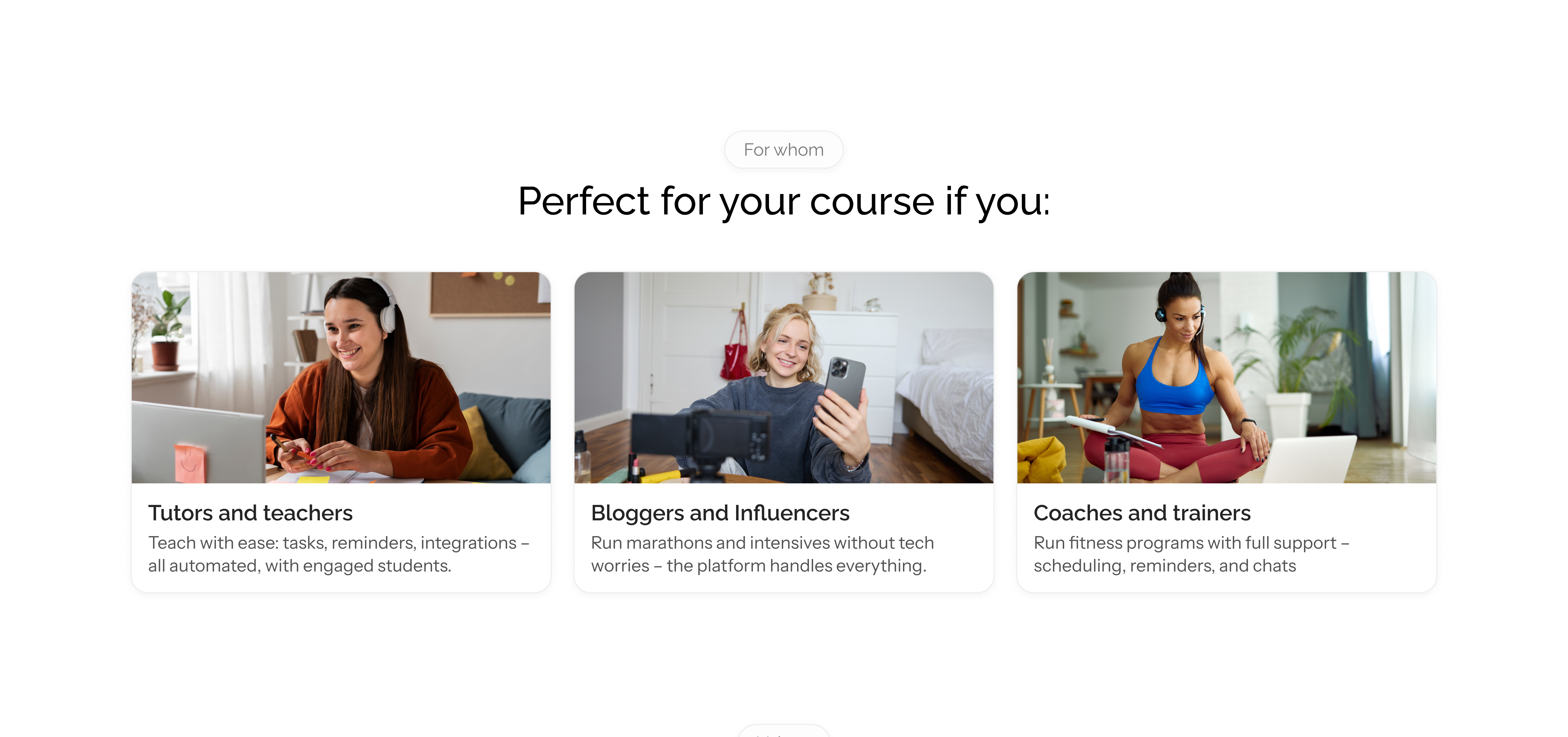
Who it's for
Mentors immediately recognize themselves in the target audience and understand the platform was built for them specifically.
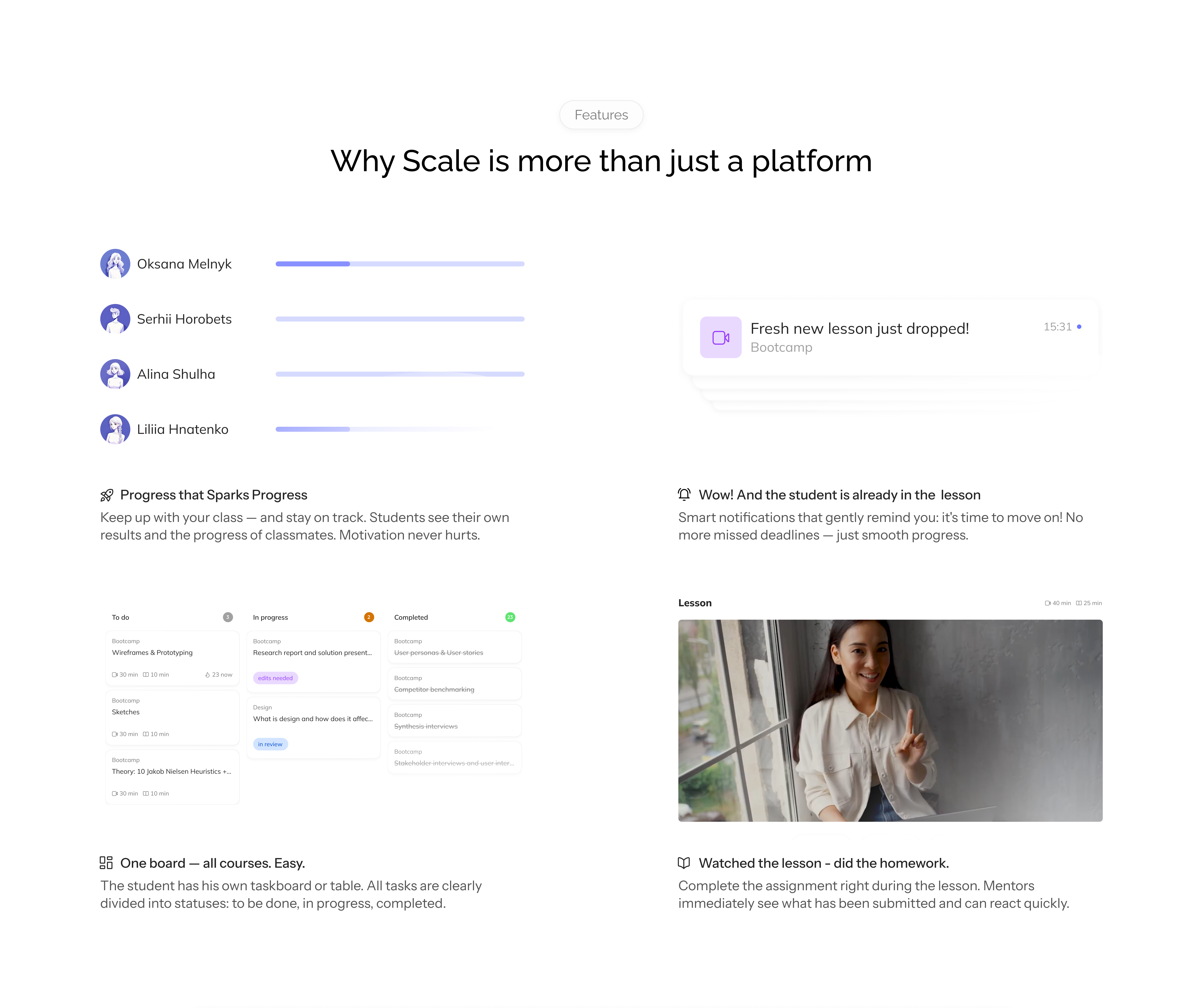
Key features
Student-facing conveniences - progress tracking, reminders, task board, homework submission. Hover animations let mentors see functionality in action without cluttering the interface.
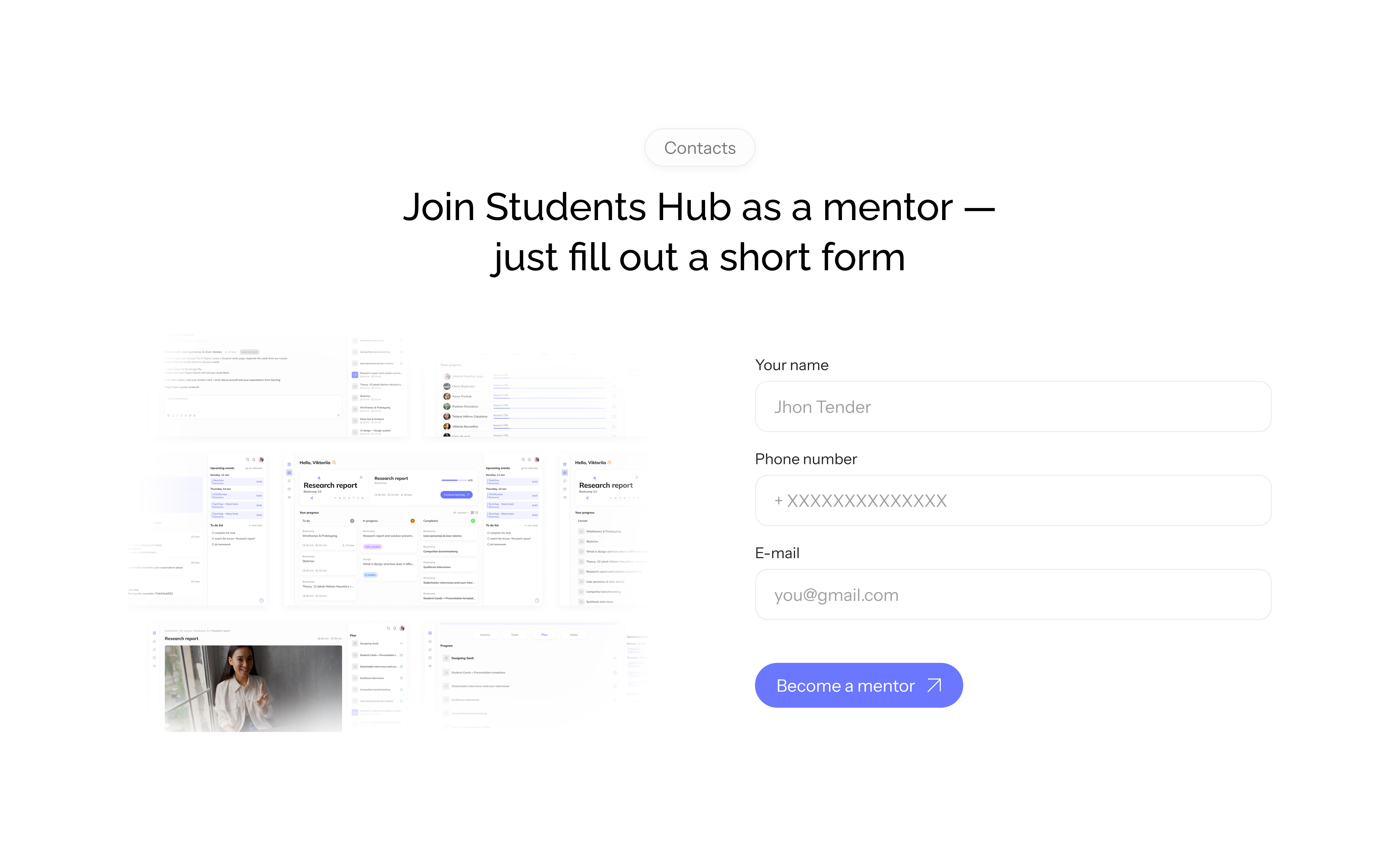
Application form
A minimal form with no unnecessary fields: only what's needed for first contact.
Final call to action
A CTA section with a "limited spots remaining" label - a light sense of urgency that encourages faster decisions.
Challenges
Convincing without hard-selling
Mentors are skeptical of new tools. The landing page needed to interest, not pressure. A classic "sell everything upfront" structure wouldn't work here.
Solution Structured the page around AIDA: first recognition in the pain points, then platform values, then features. The mentor arrives at the decision themselves rather than having it pushed on them.
A style that doesn't look like EdTech
Most education landing pages share a recognizable look: bright colors, illustrations, an academic tone. The goal was a style that feels modern and doesn't blend in with the competition.
Solution Collected references from tech products, startups, and creative services. Minimalism, calm colors, and smooth animations make the result feel closer to a SaaS tool than an educational platform - and that's the differentiator.
Selling to mentors through the student experience
At the time of launch, the platform had only the student-facing functionality built out. Mentors needed to be interested and convinced to buy the product for their students - but through concrete learning value, not abstract promises.
Solution Built the features section around the student experience: progress tracking, reminders, task board, homework submission. Mentors see how the platform improves student engagement and outcomes - understanding the value through their students' side, not through a list of technical capabilities. Hover animations let them feel the product without extra copy.
Screens

Outcome
The landing page matches the platform's visual style and creates a consistent experience for both mentors and students. The minimalist design with smooth animations holds up across both versions - without clutter, without templates.
This project showed me how marketing logic and UX thinking can reinforce each other: page structure is a design decision too.