 Viktoriia Shakhnir
Students Hub Mobile
A mobile app for iOS and Android built on top of an EdTech web platform
Overview
Students Hub Mobile is a mobile learning app built on top of the Students Hub web platform. Two separate apps: one for iOS, one for Android, each with native navigation and platform-specific components.
The goal was to make learning available anywhere - even offline. Students needed a complete experience: courses, progress, homework, all from their phone, without it feeling like a stripped-down web version.
- 1
Web platform analysis
Identified core features to carry into mobile and prioritized them for the MVP scope
- 2
Platform guidelines research
Studied Apple HIG and Material Design, explored native apps to understand typical user patterns
- 3
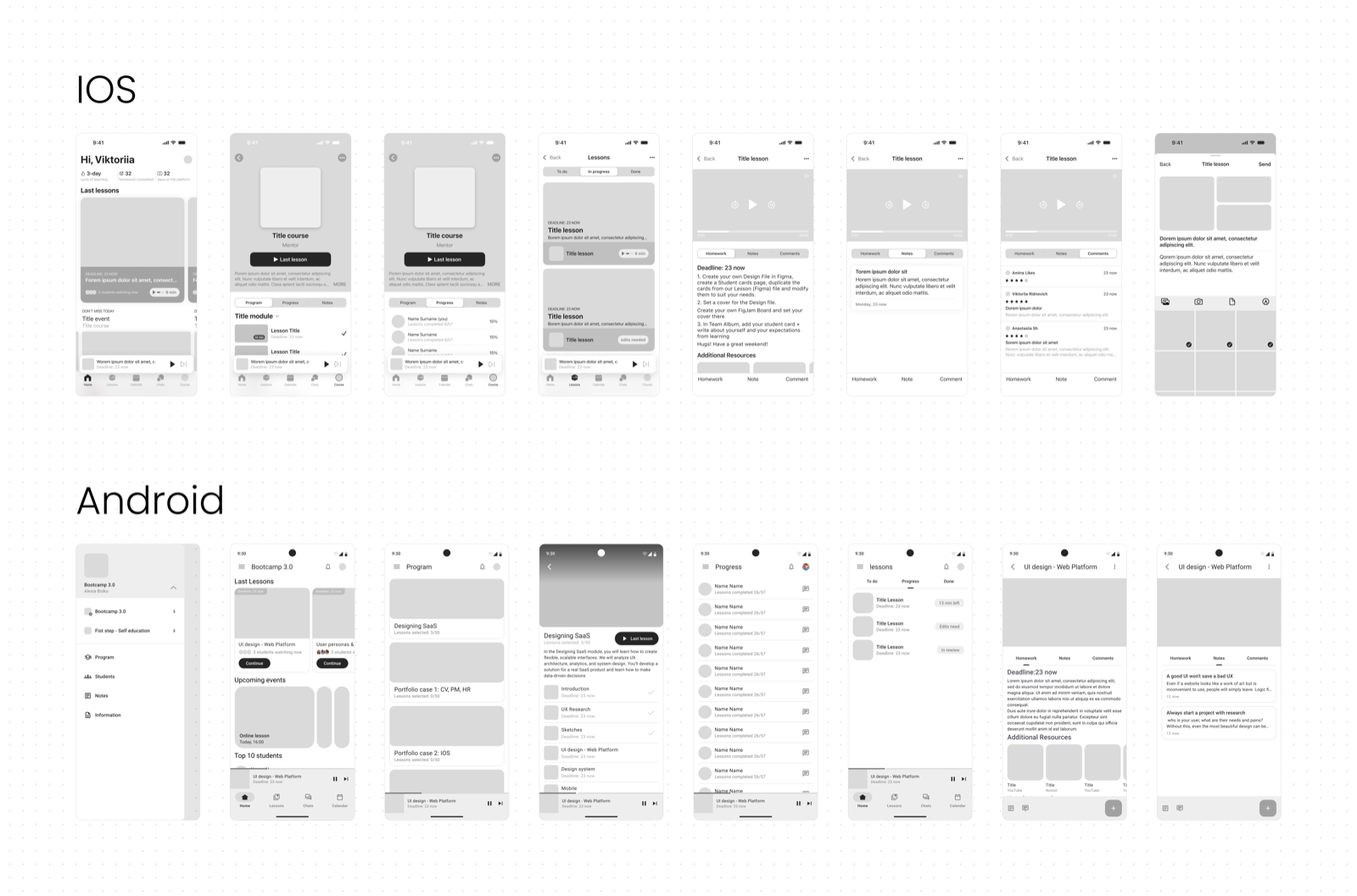
Wireframes
Mapped structure and navigation separately for iOS and Android, accounting for platform-specific patterns
- 4
UI Design and design systems
Designed two separate experiences based on HIG and Material Design with a shared brand identity
- 5
Prototypes
Built clickable prototypes for both platforms with focus on native feel and usability
Discovery
The core UX research was completed during the Students Hub web platform project. Research findings, personas, and key insights are available in the web platform case study.
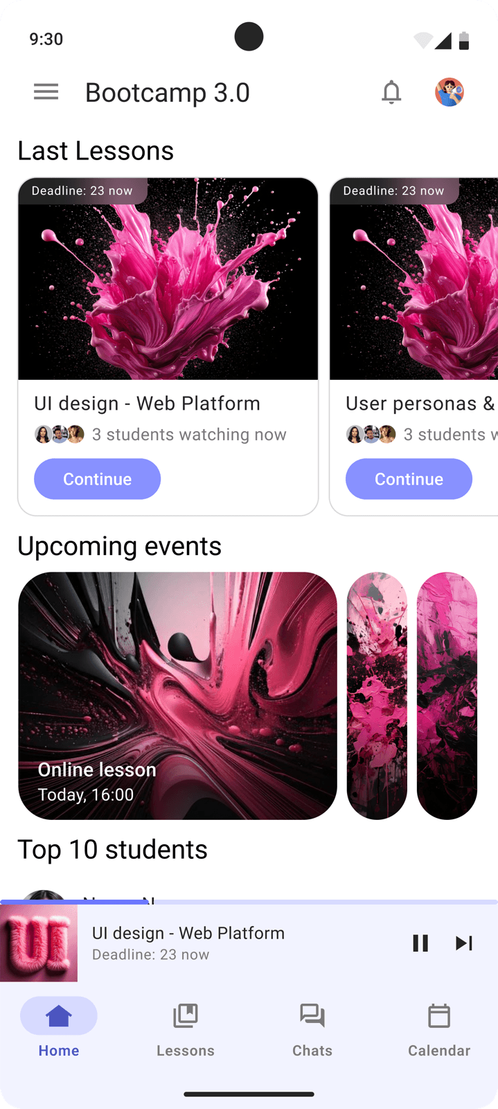
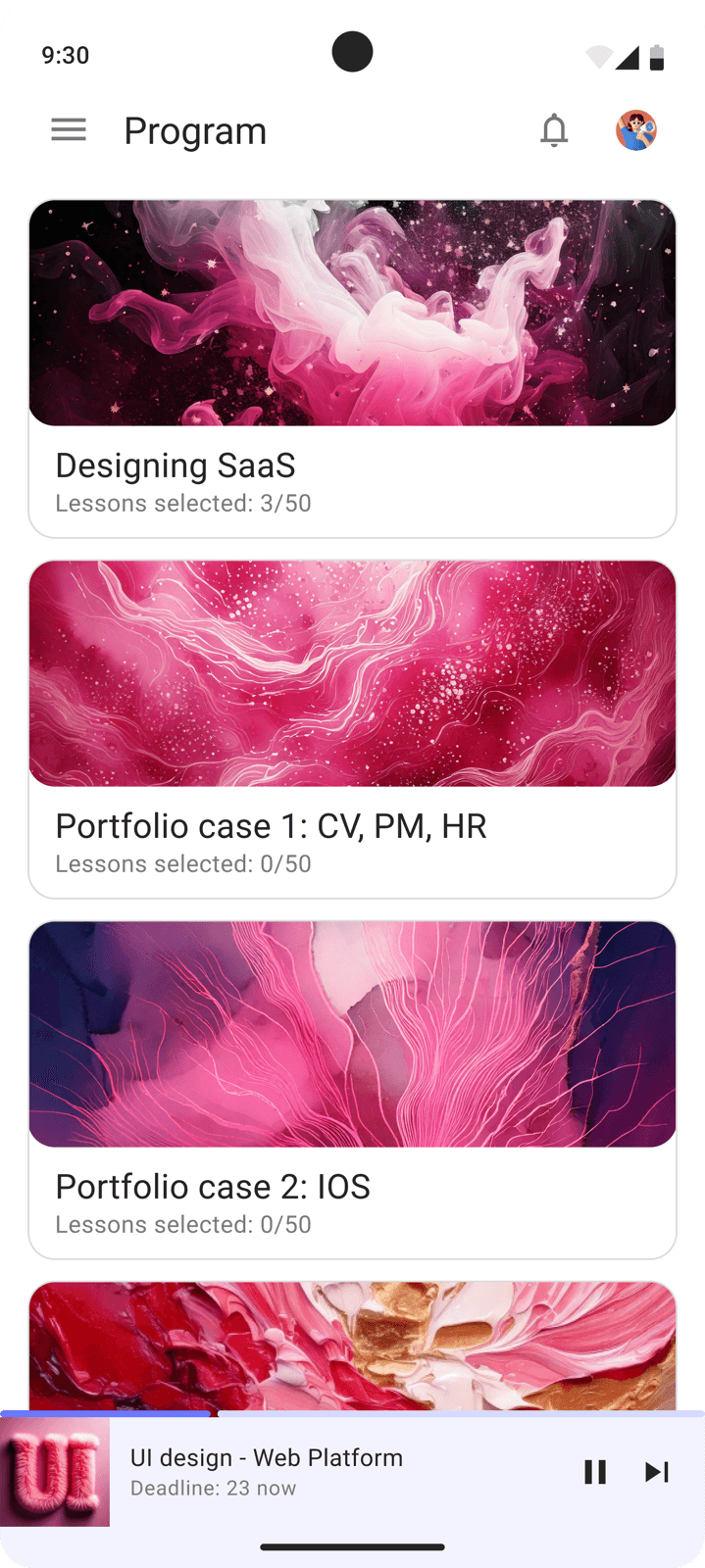
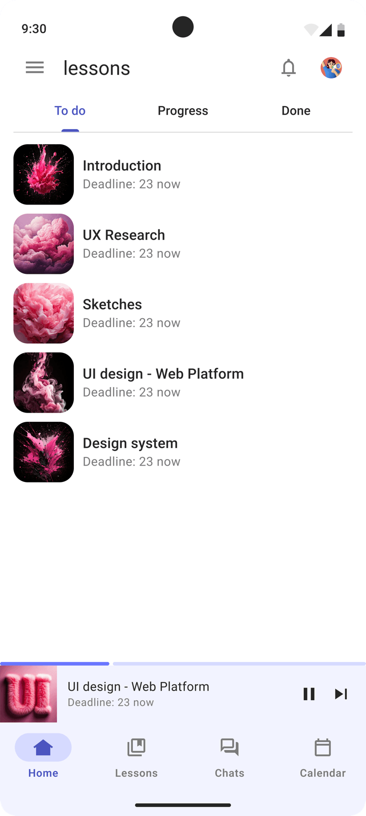
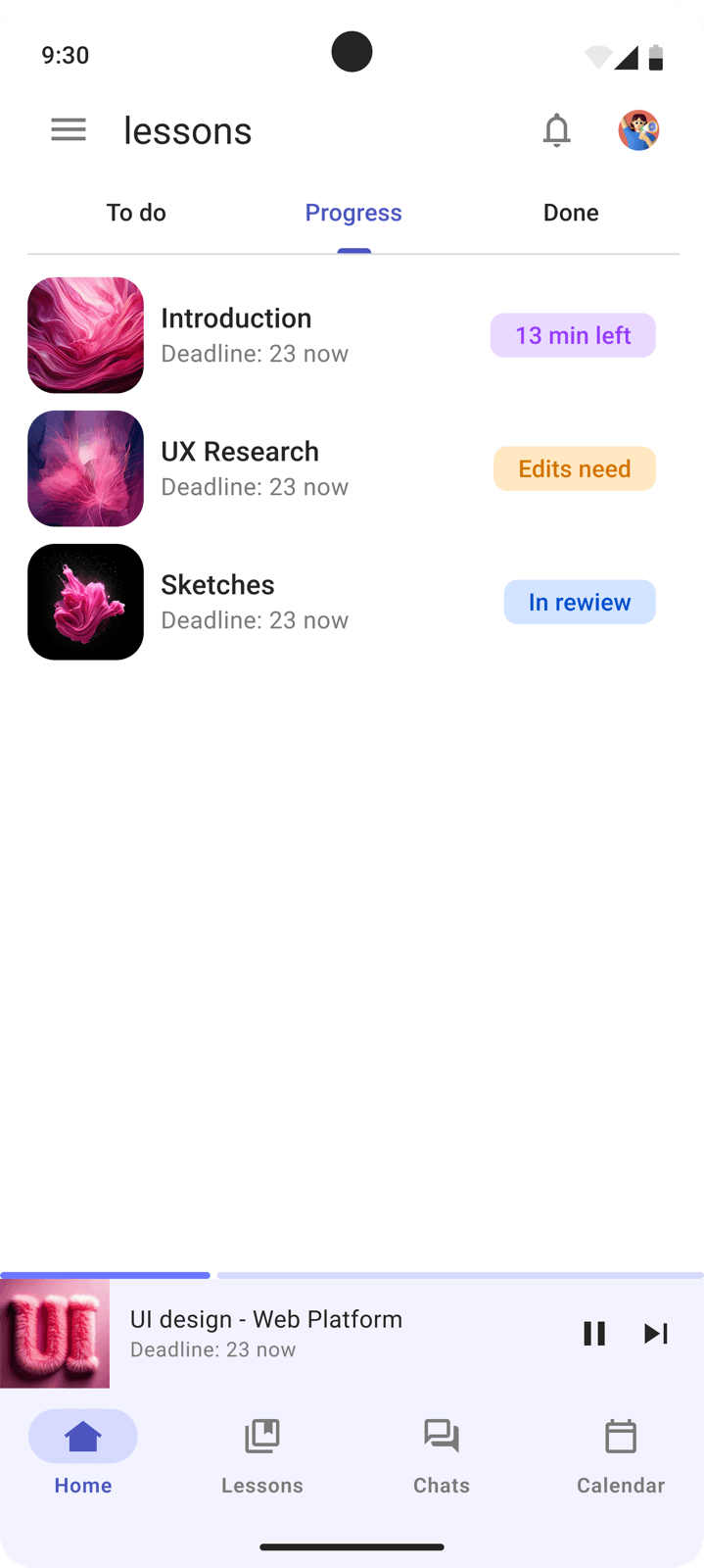
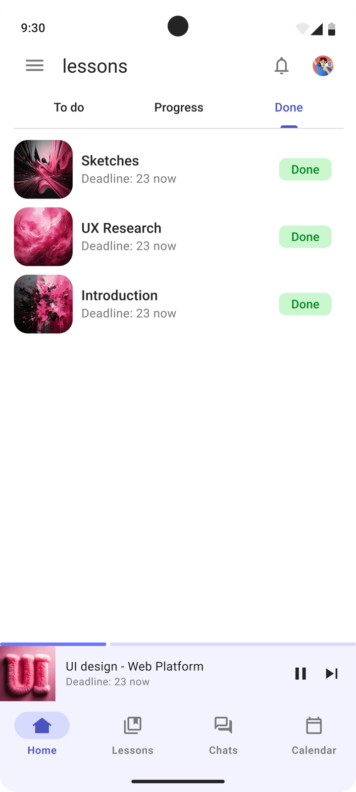
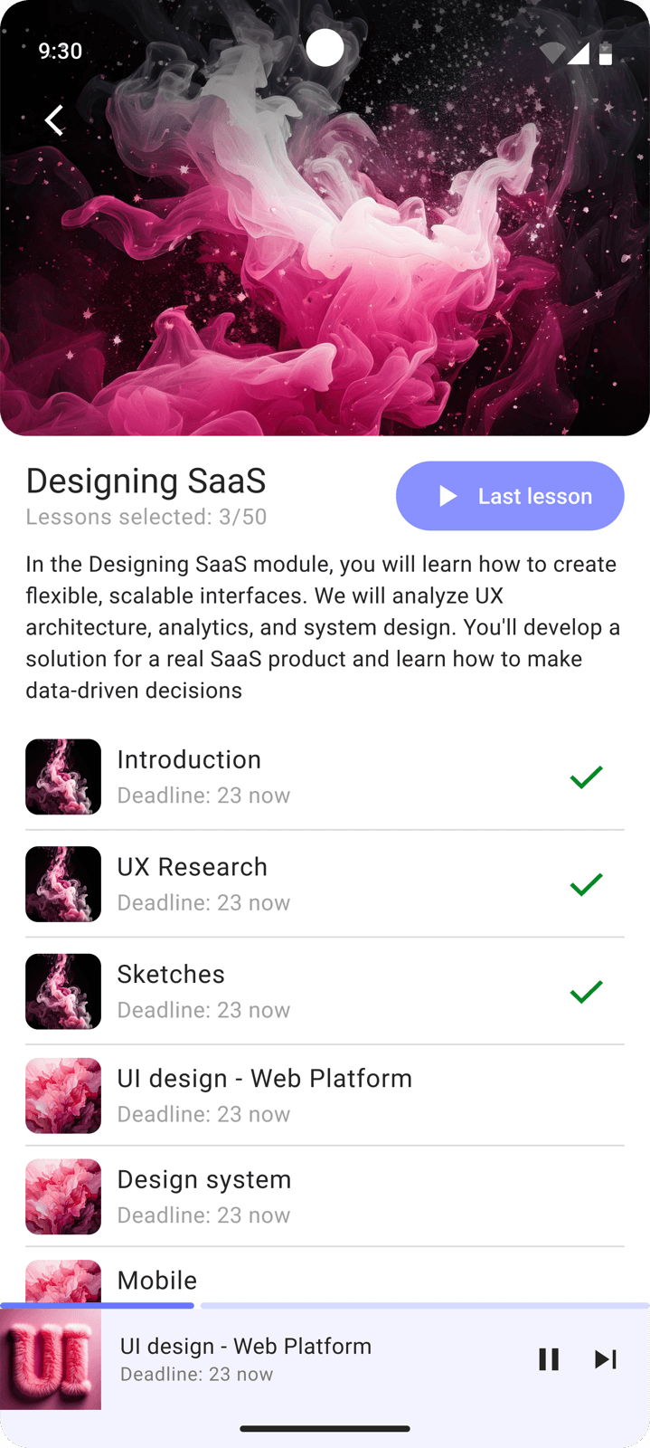
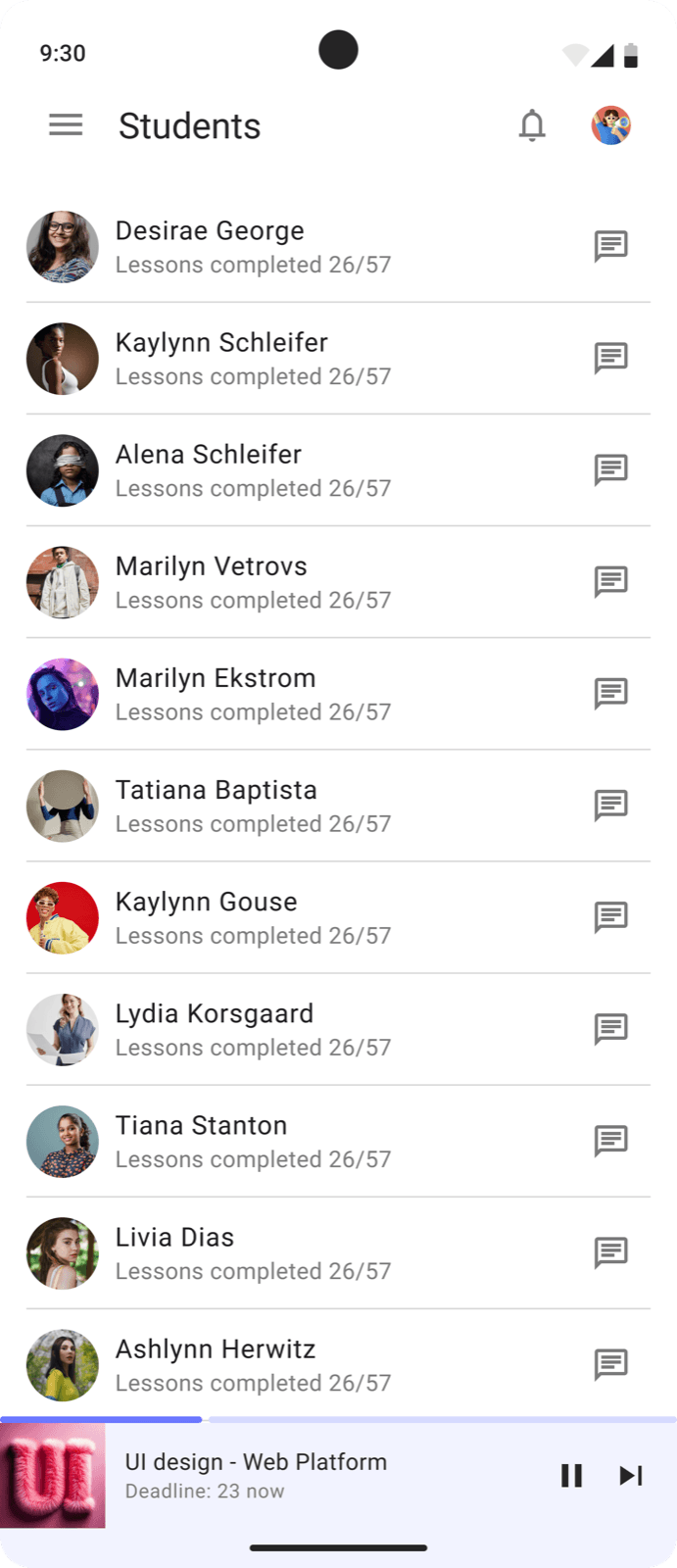
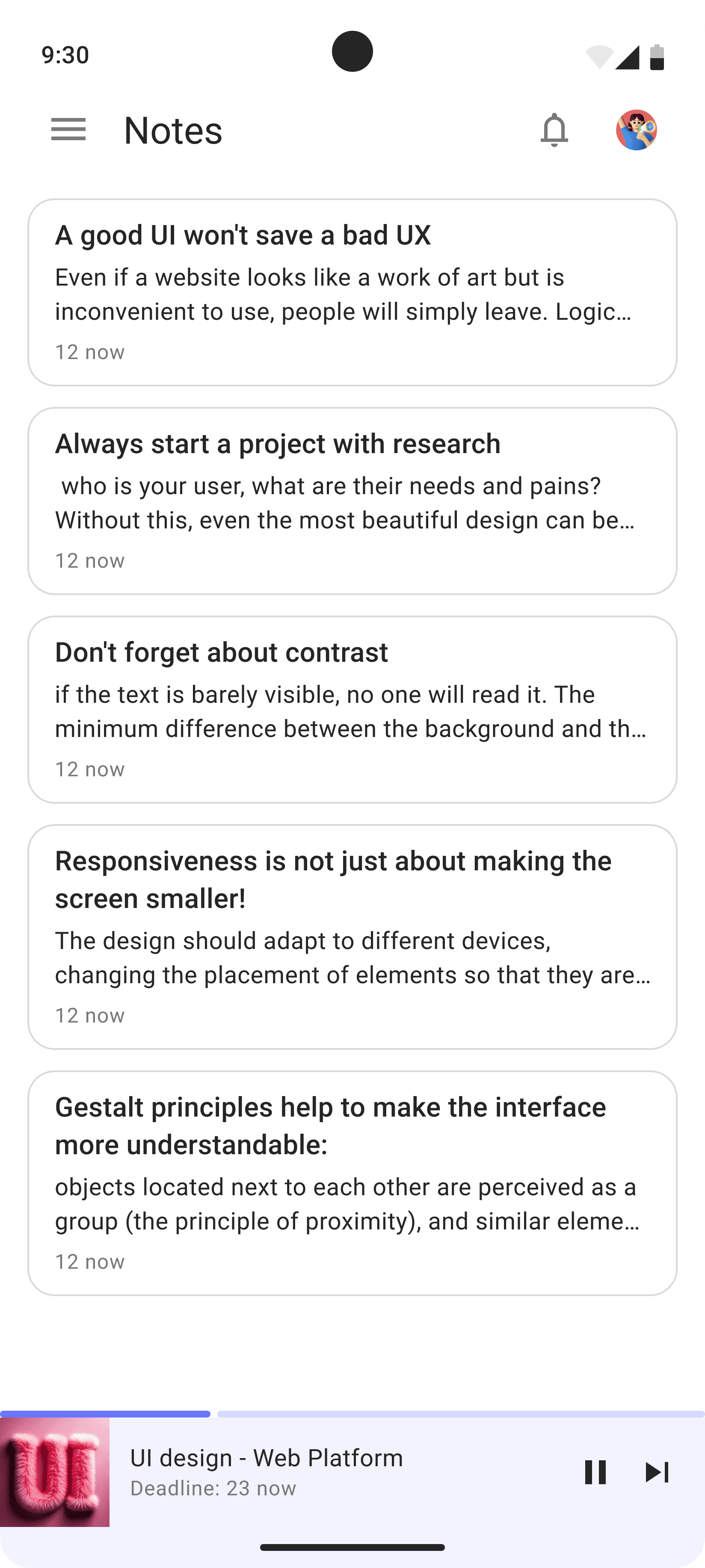
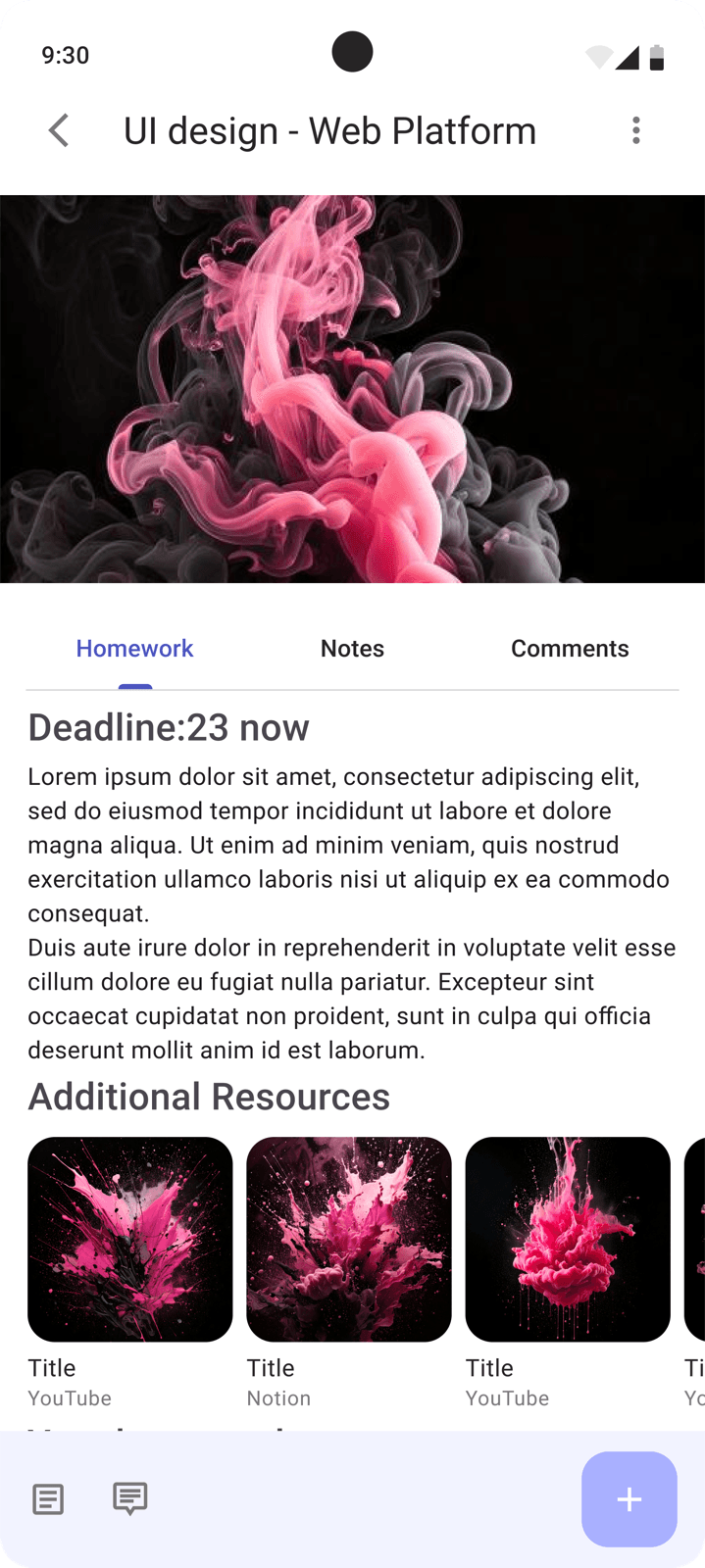
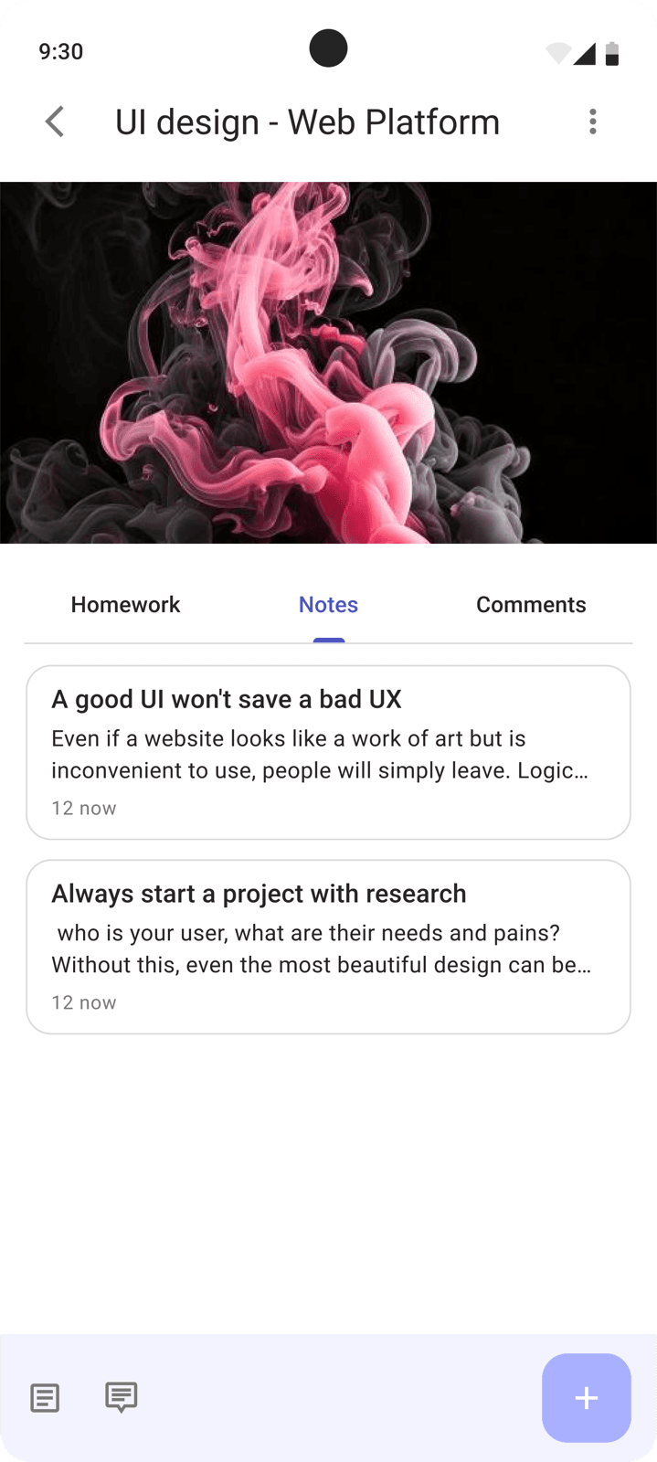
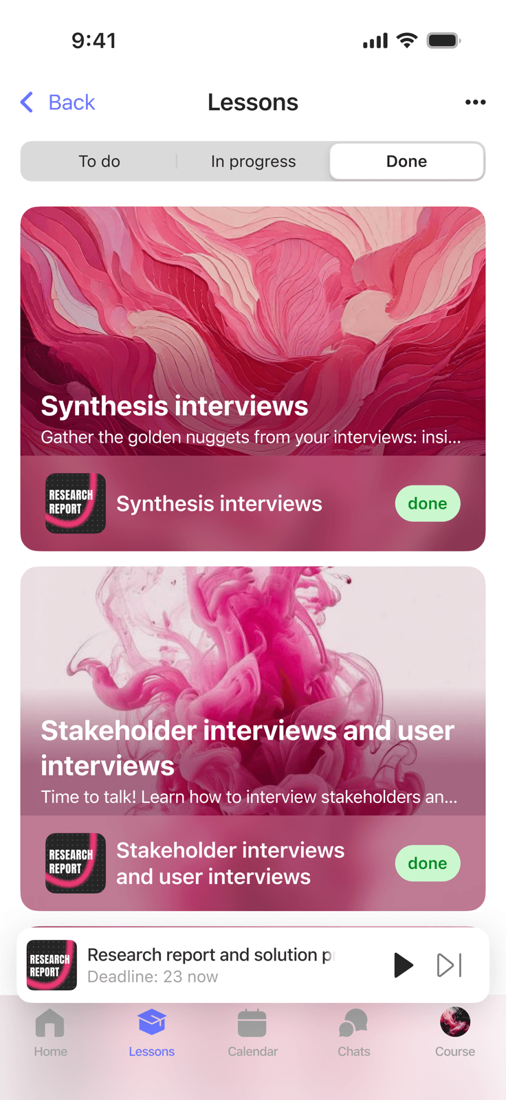
From that foundation, I analyzed the platform to identify features critical for mobile: lesson viewing, course structure, progress tracking, homework, events, and reminders.
Wireframes
Before moving to UI, I worked through Apple HIG and Material Design to understand navigation patterns for each platform. I also studied native apps: Calendar, Apple Music, Gmail, Google Maps, Notes, App Store, Google Play - to understand how users move through mobile products.
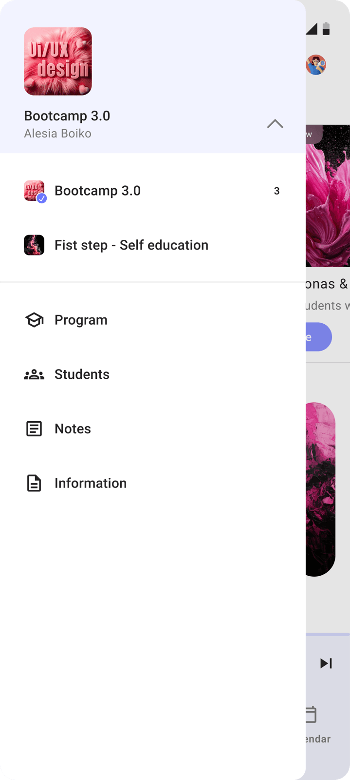
The app structure is adapted from the web platform's UX, reshaped for mobile. iOS got a tab bar, Android a burger menu - each matching the familiar patterns users expect on their platform.
Challenges
Two platforms, one product
iOS and Android have different navigation logic, different components, different typography, and different interaction patterns. The product still needed to feel like one: same brand identity, same learning experience.
Solution Built two separate design systems: one based on HIG with SF Pro and native iOS components, one based on Material Design with Roboto. A shared color scheme and content structure kept the product unified despite platform differences.
Adapting web to mobile
The web platform has expanded navigation, dense tables, and large data sections. Mobile needs to avoid overloading the user. Everything has to fit a small screen and still stay clear.
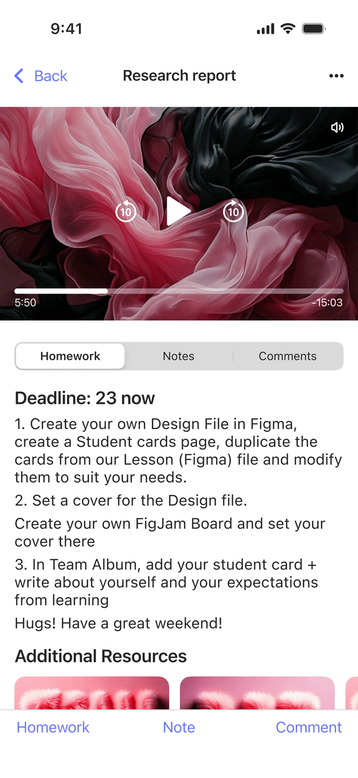
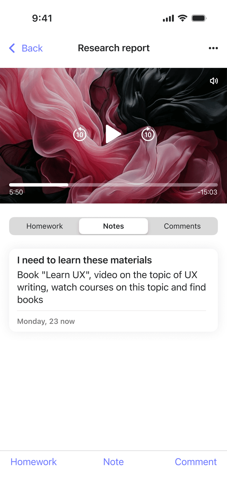
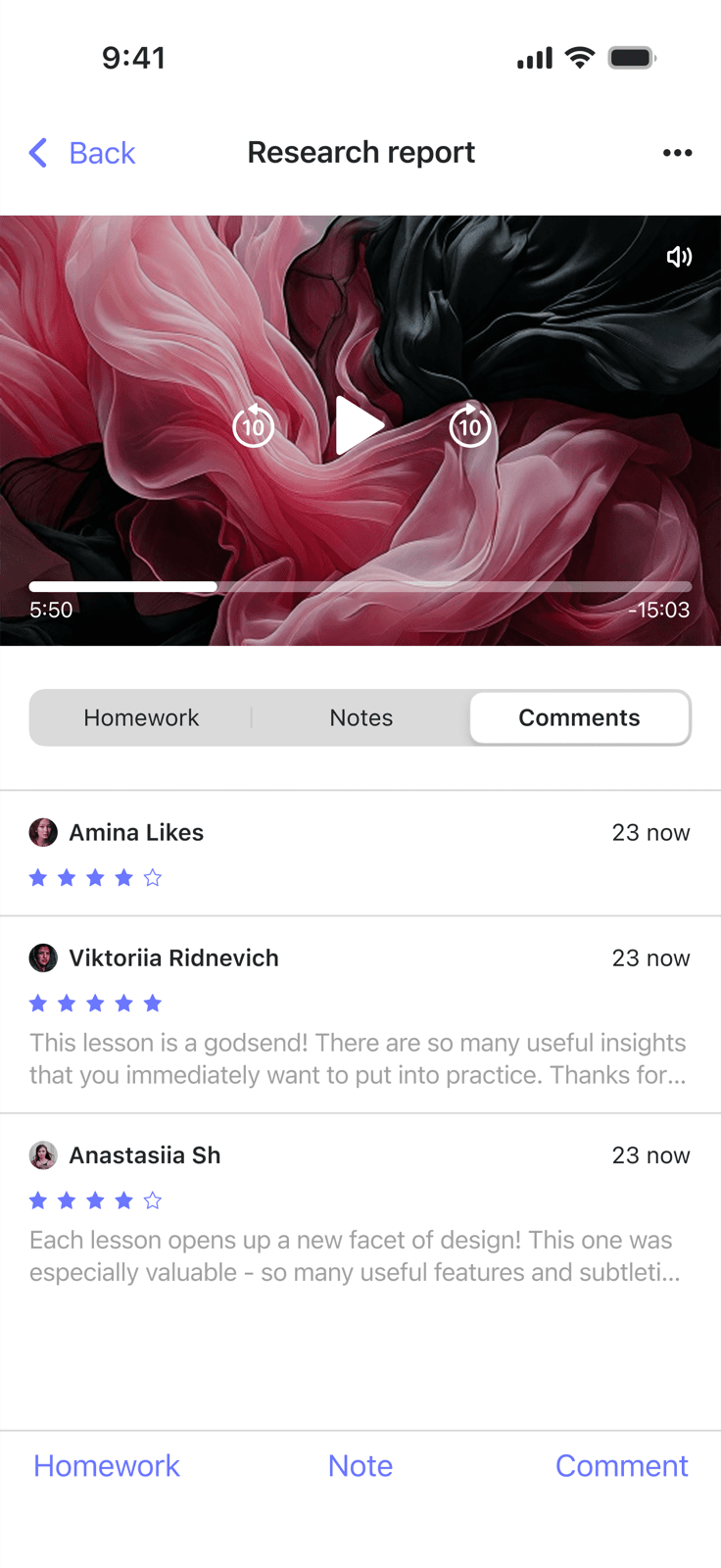
Solution Rethought the content hierarchy for each module: what goes on the first level, what goes one level deeper. Priority: the core student actions - open a lesson, check progress, submit homework. Everything else is a tap away.
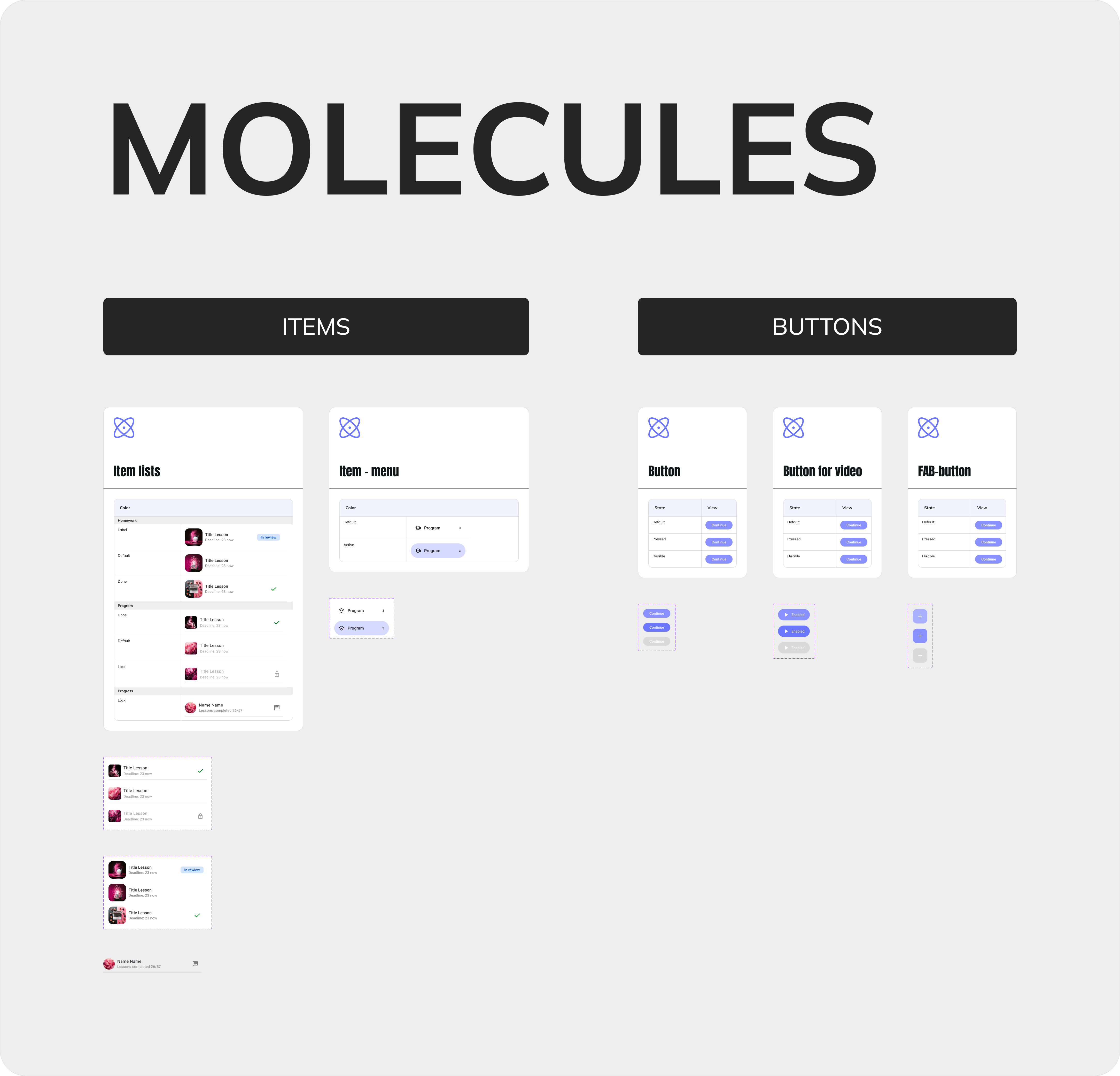
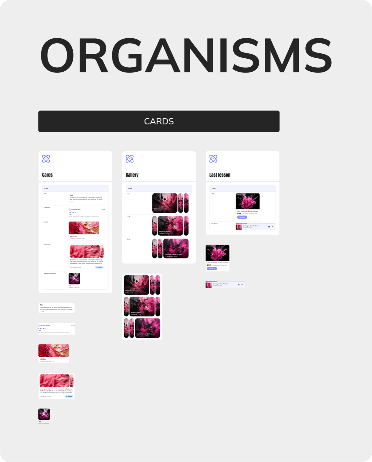
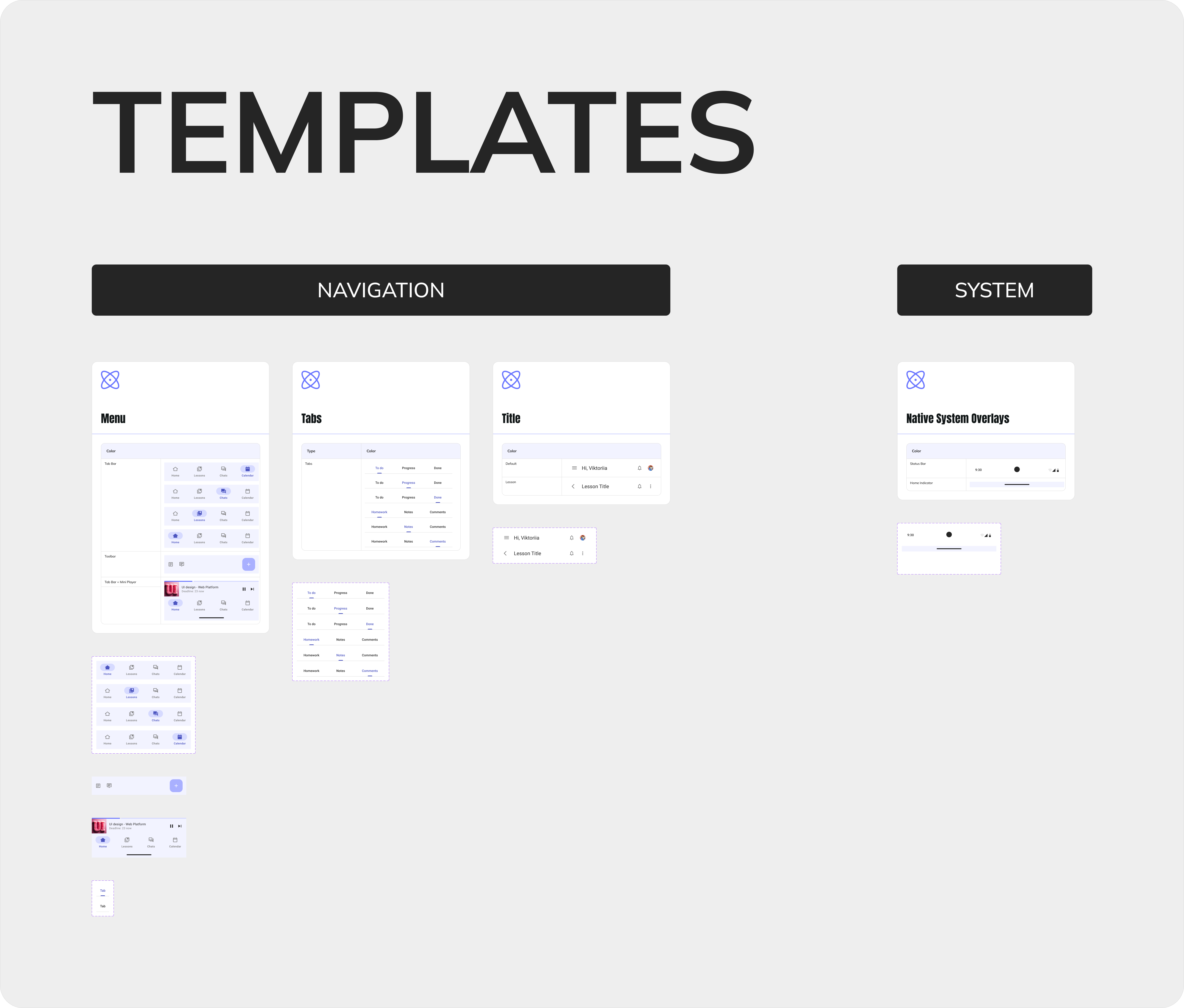
Design System
A full design system for each platform: from atoms to templates. Both systems follow the same structural logic but reflect the conventions of their platform.
iOS - built on Apple Human Interface Guidelines: SF Pro, native components, tab bar navigation, platform-specific animations.
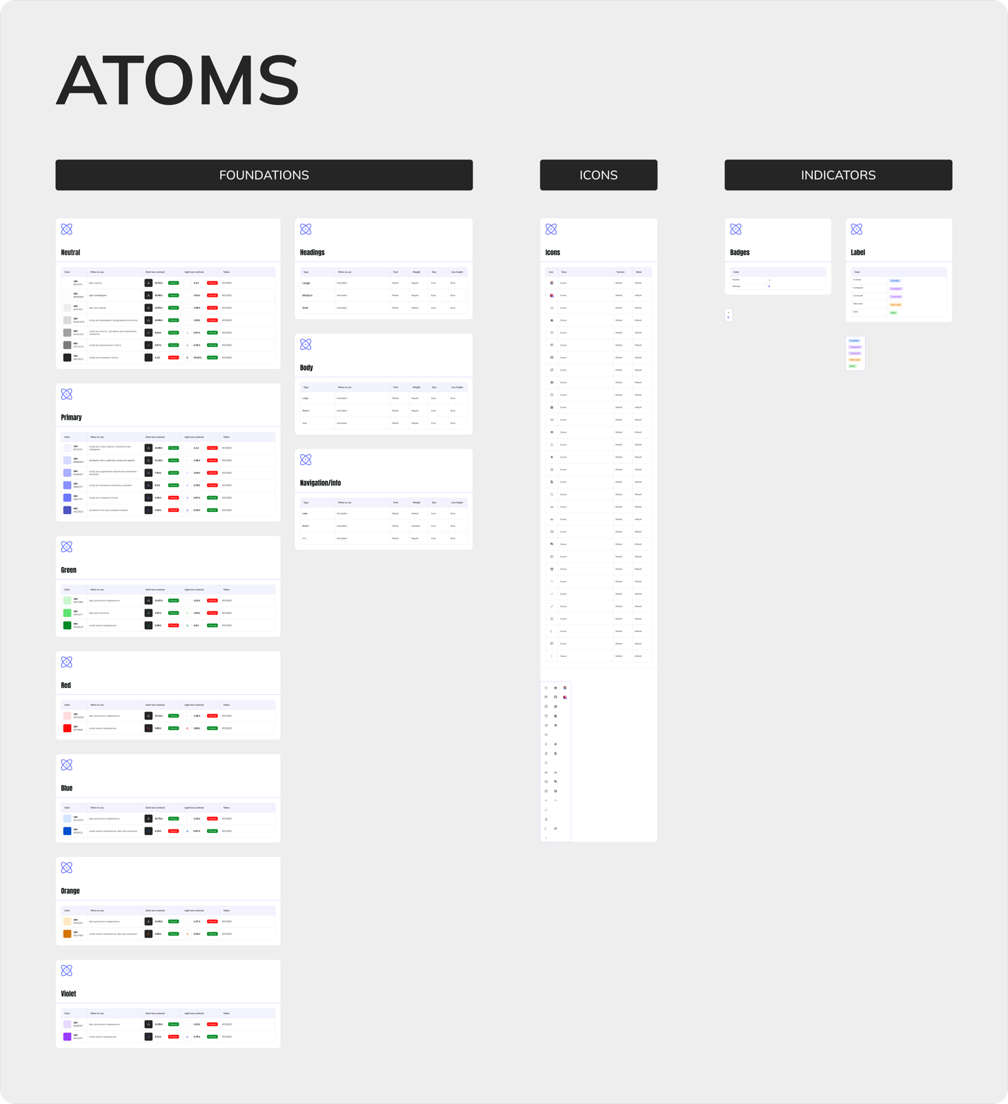
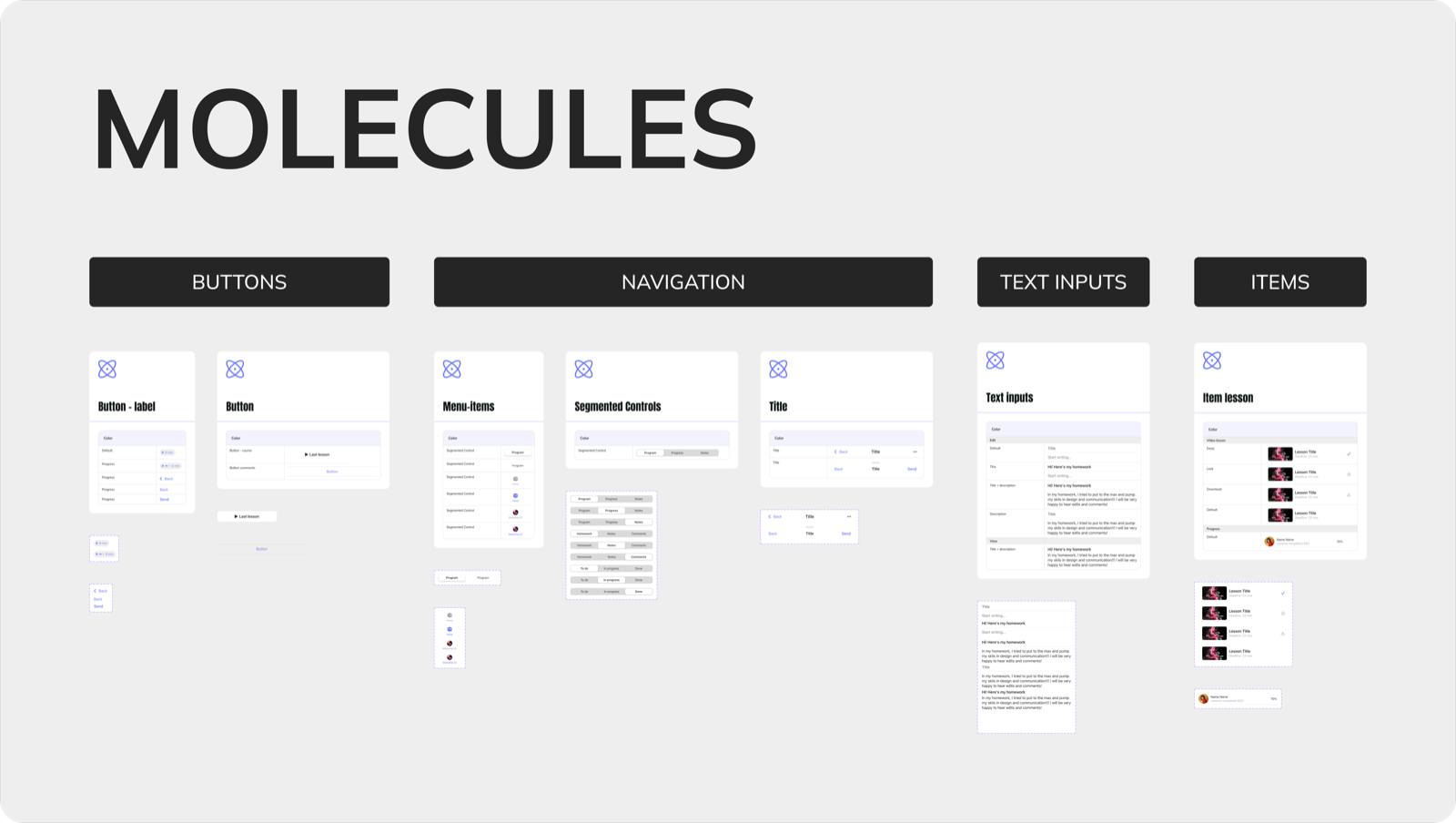
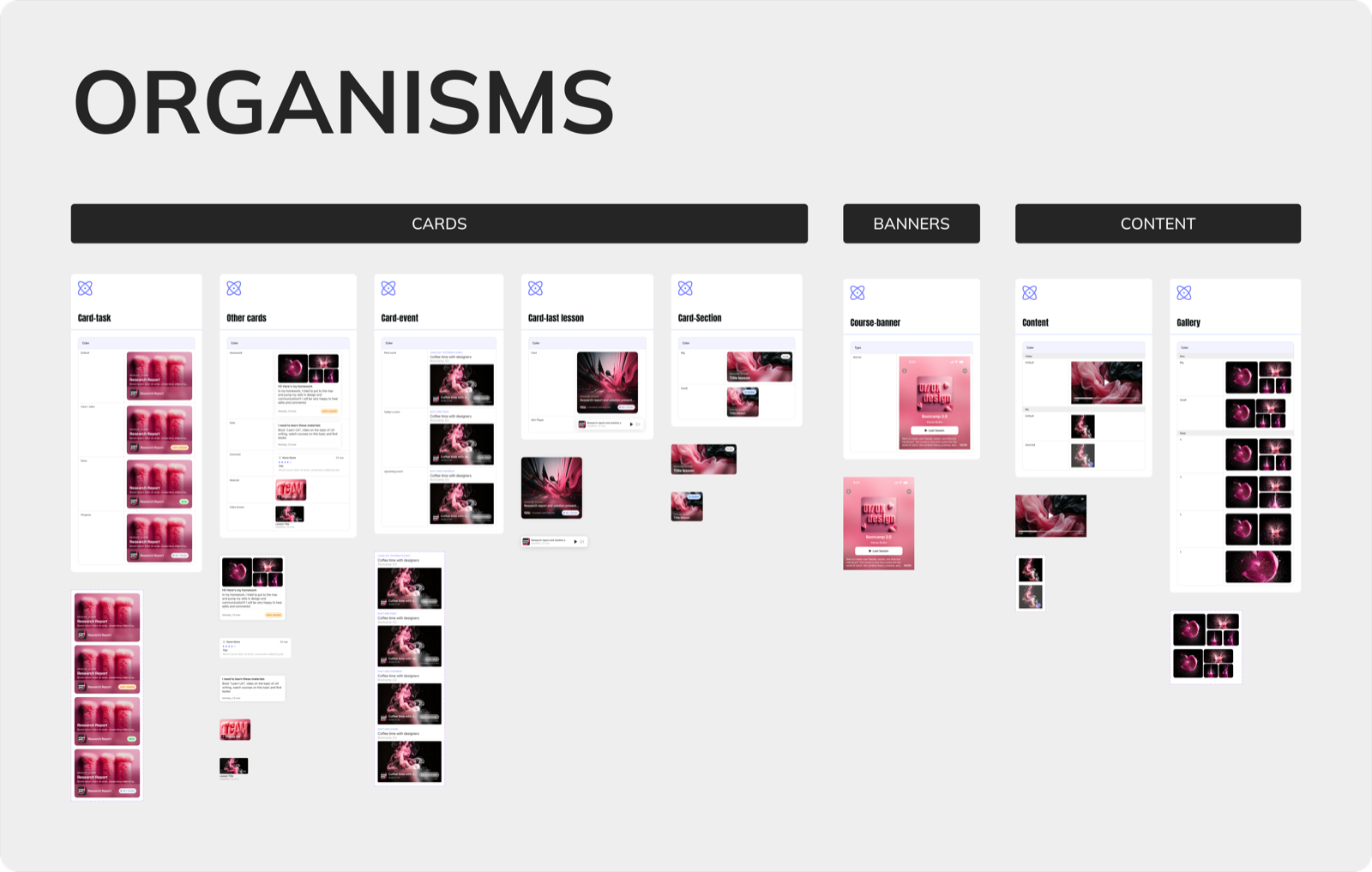
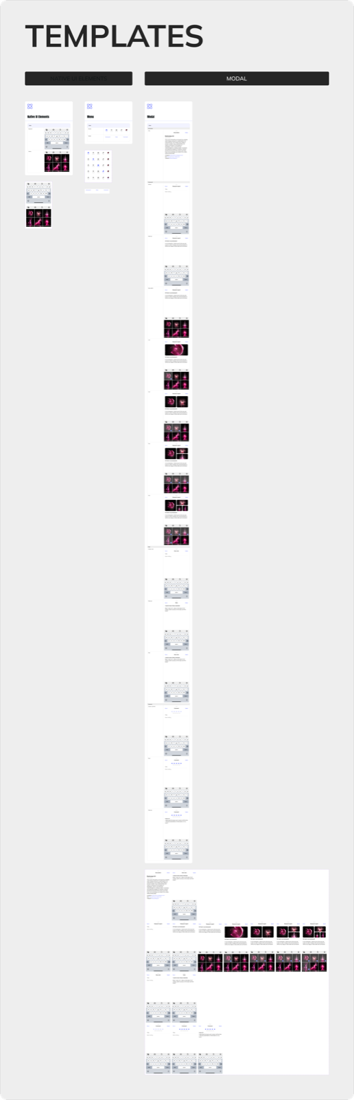
Android - built on Material Design: Roboto, Material components, burger menu, its own spacing and animation system.

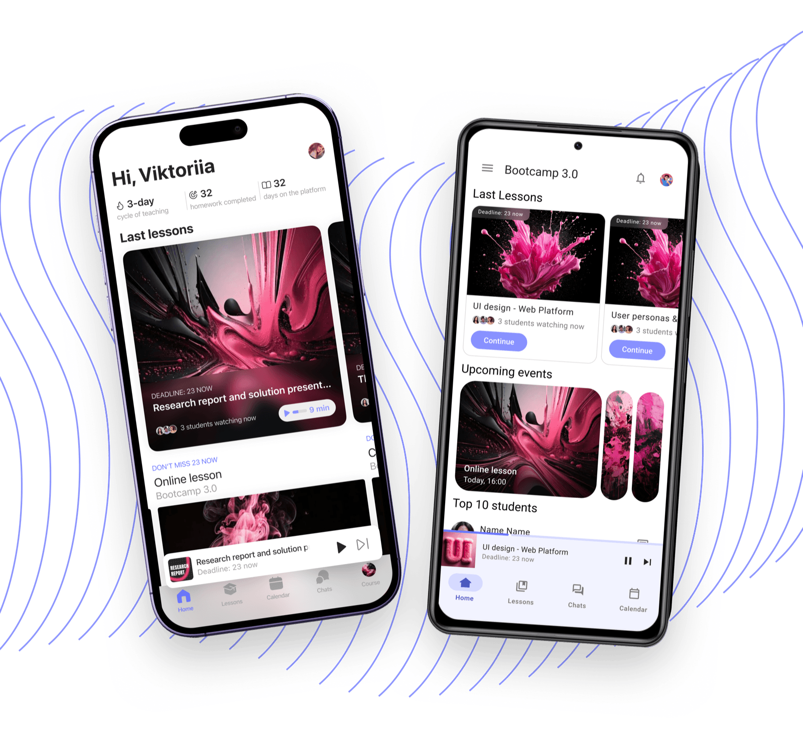
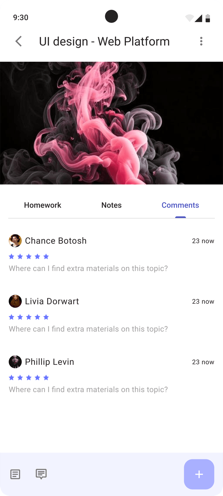
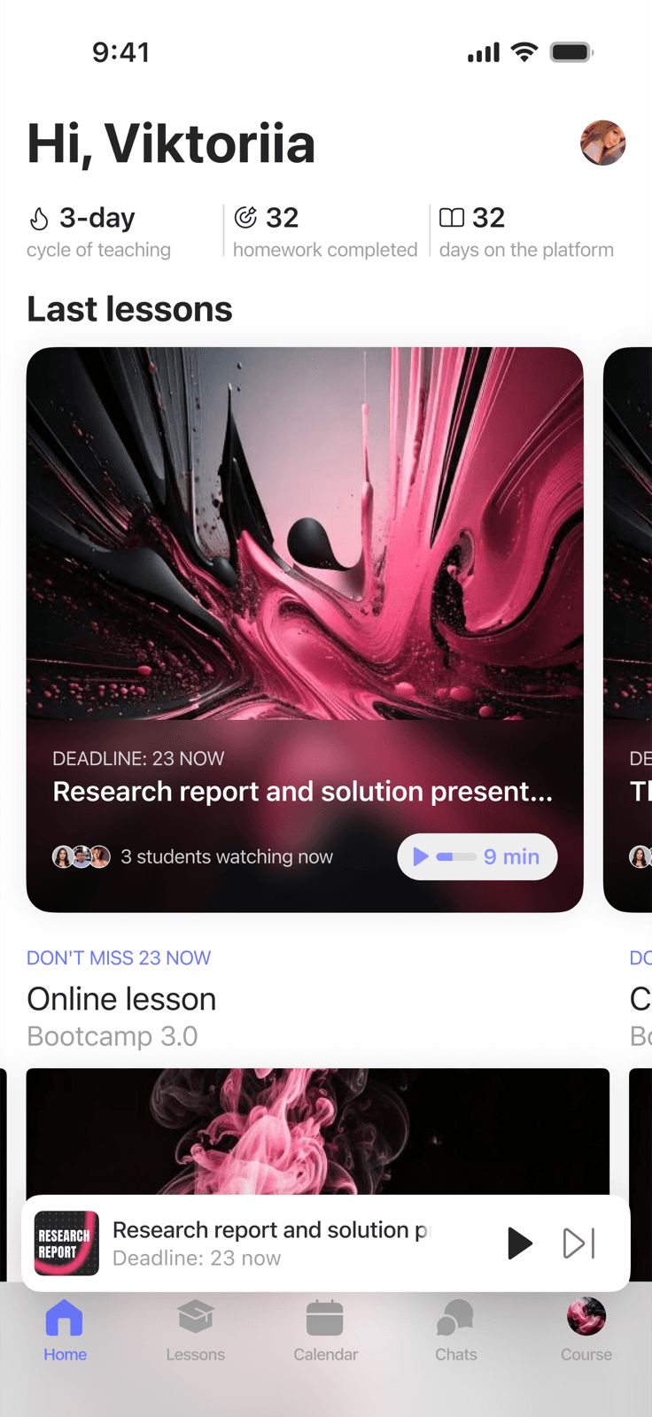
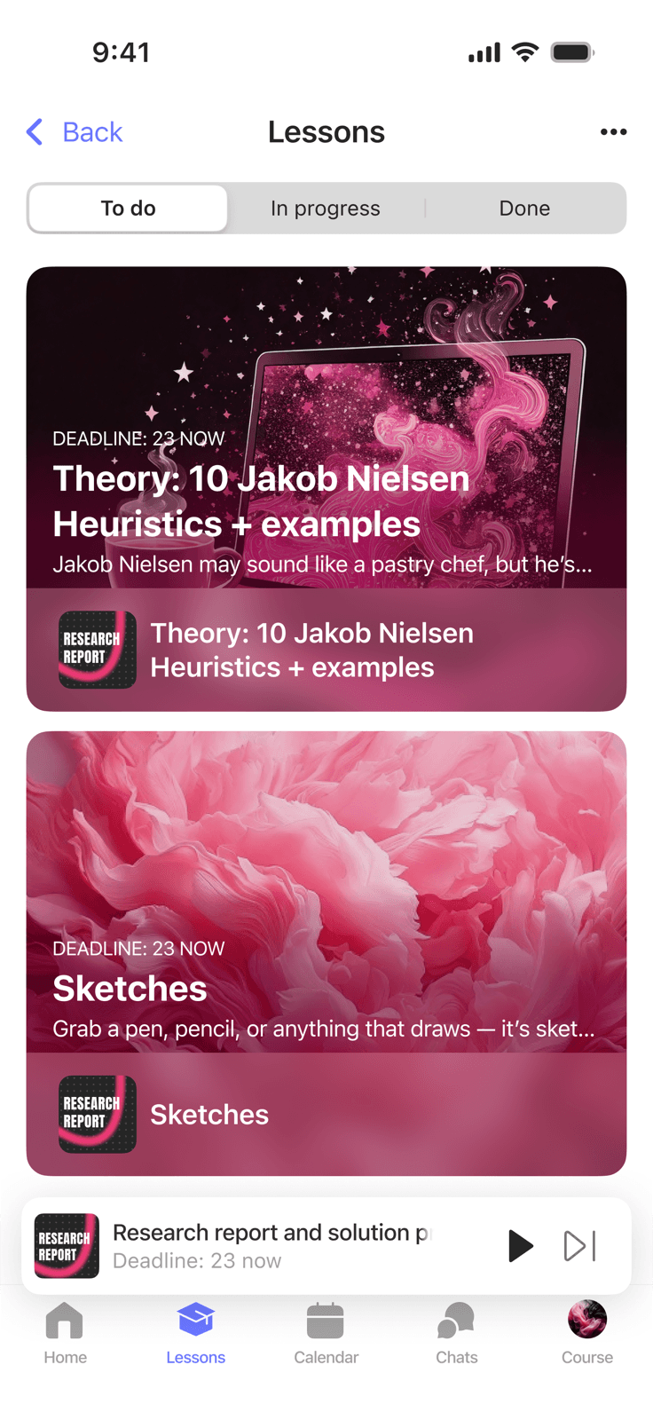
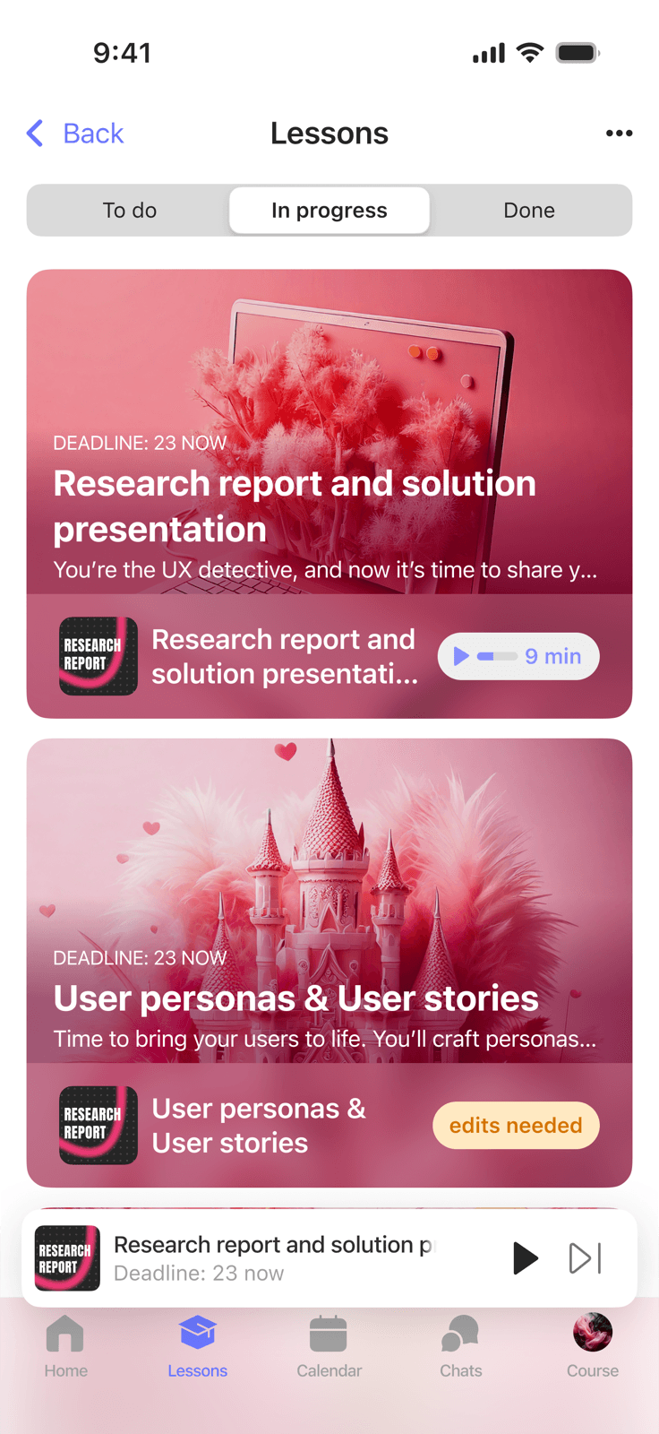
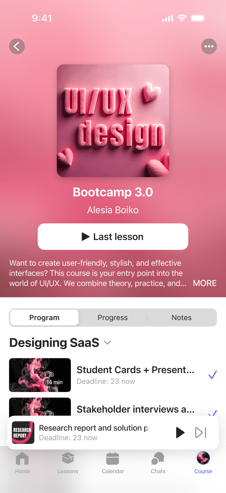
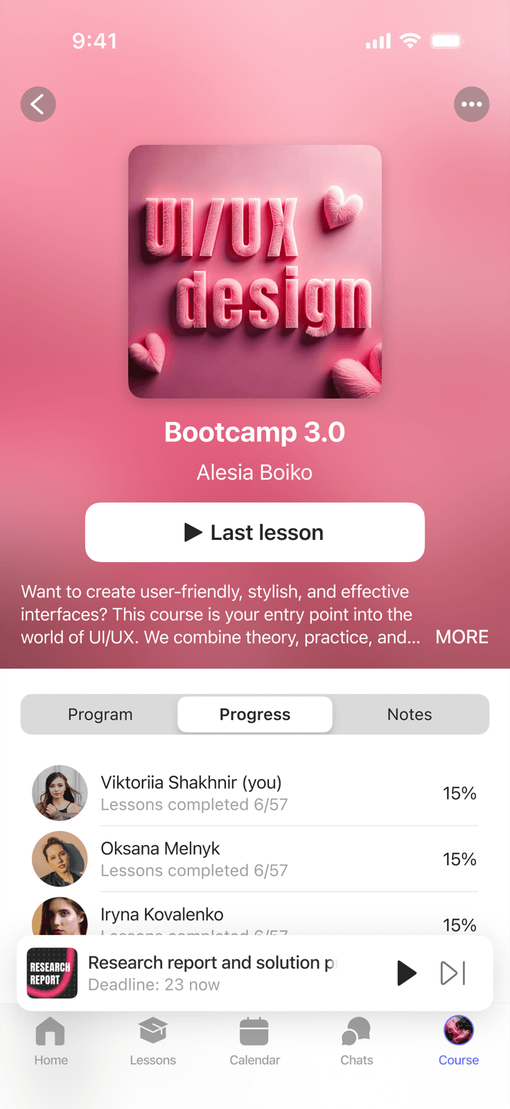
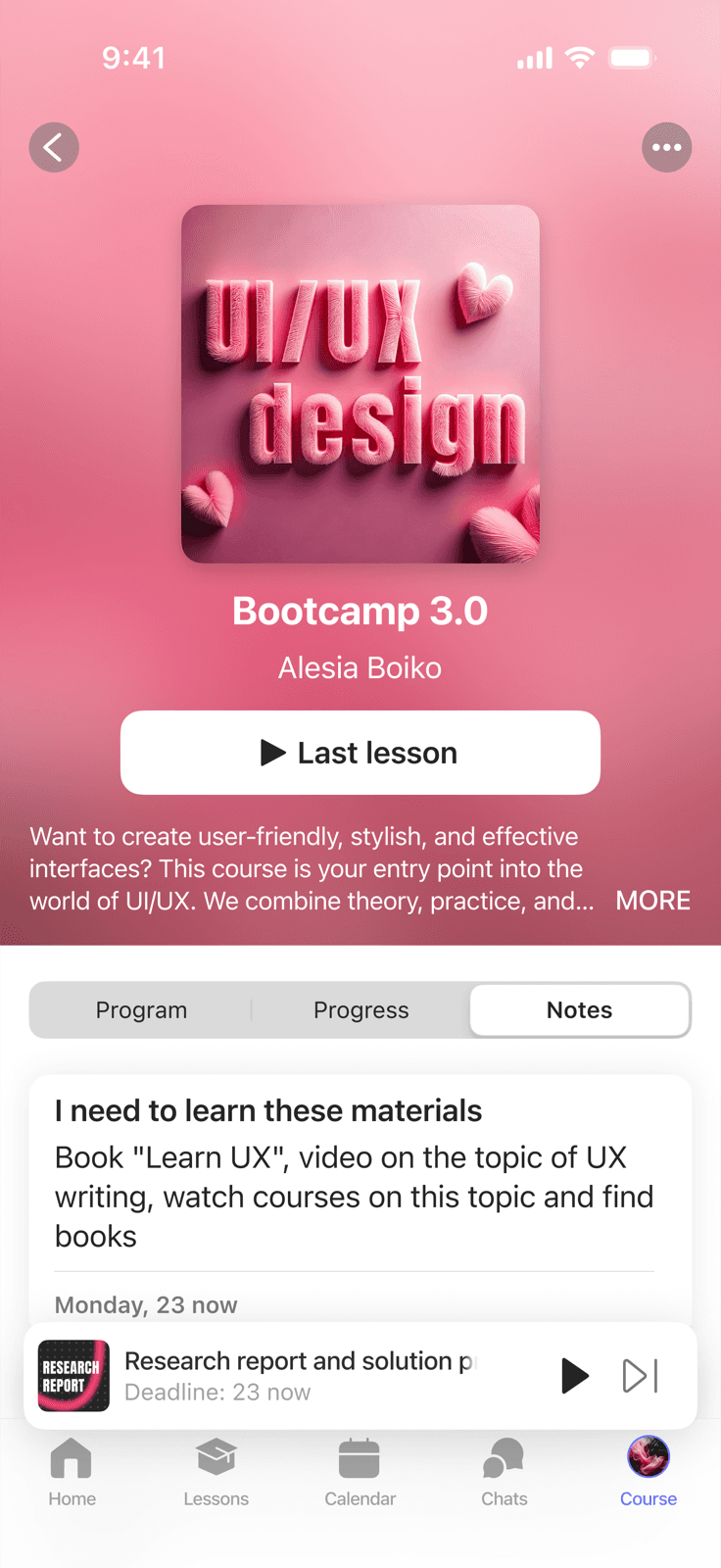
Screens
Outcome
Two apps with a native feel on each platform and a shared brand identity. Students get a complete mobile learning experience - not a stripped-down version of the web.
This project showed me how important it is to understand platform conventions from the inside: not just knowing that iOS has a tab bar, but understanding why it's there and how it shapes the entire UX. Working with two design systems in parallel was its own lesson in how to keep things unified without making them uniform.