 Viktoriia Shakhnir
Overview
Students Hub is a web platform where all a student's courses live in one place. Lessons, assignments, notes, progress, and schedule - no switching between different tools.
The goal was to bring the entire learning process into one space. Clear course structure, visible deadlines, and organized materials help students focus on learning rather than finding their way around.
- 1
Research
Conducted student interviews and surveys, built personas, analyzed competitors
- 2
Conceptualization
Defined the platform feature set through key screen sketches and built a moodboard
- 3
Wireframes and testing
Built wireframes and ran a usability test through Maze
- 4
UI Design
Designed the final visual UI across all screens and built a design system
- 5
Prototype
Built a clickable Figma prototype with two paths: active learning and onboarding
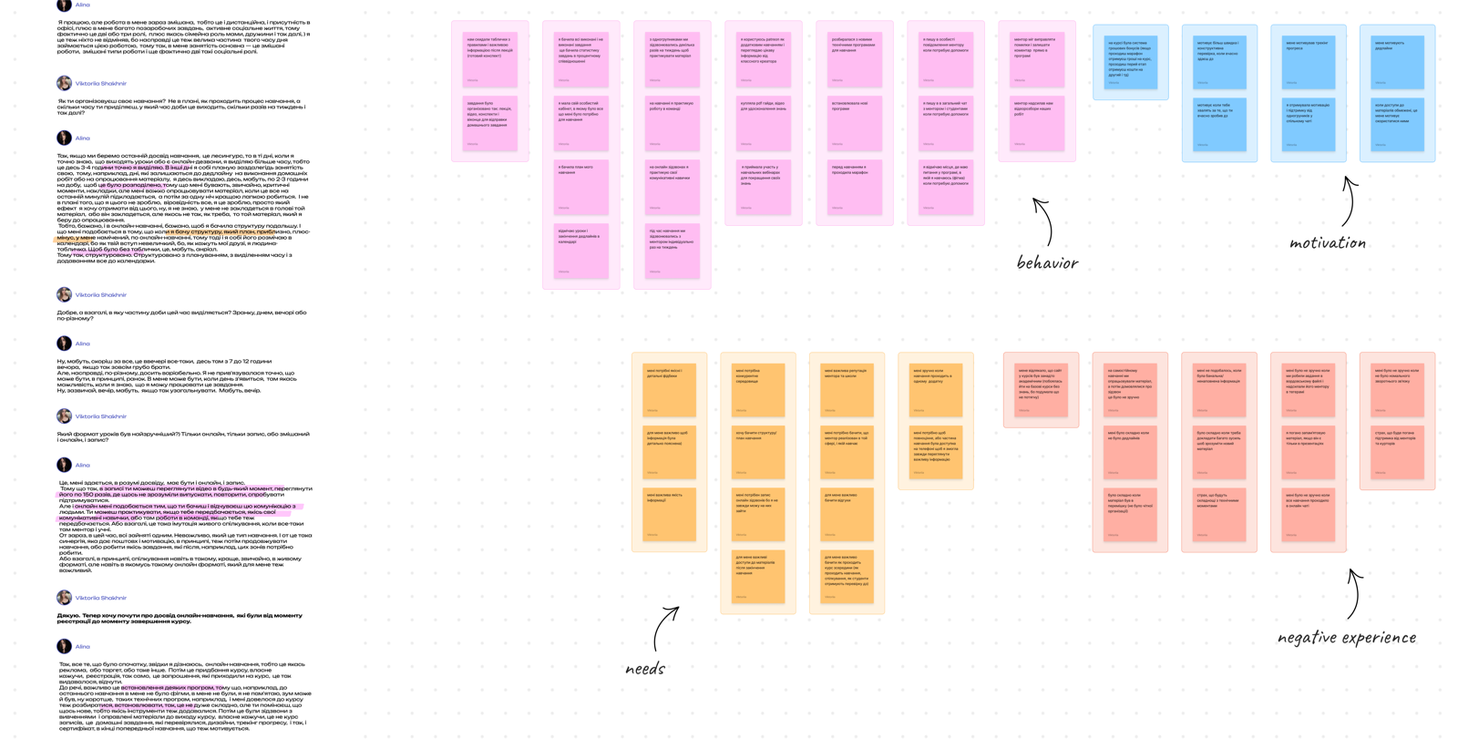
Research
User interviews
Goal: hear about students' past experiences, problems, motivation, and concerns during learning - to define the platform's future feature set.
- Students want all their materials, assignments, progress, and schedule in one place
- Progress visualization and clear planning sustain motivation
- Clear deadlines help organize time and encourage task completion
- The main problem is material overload and the absence of a clear course structure
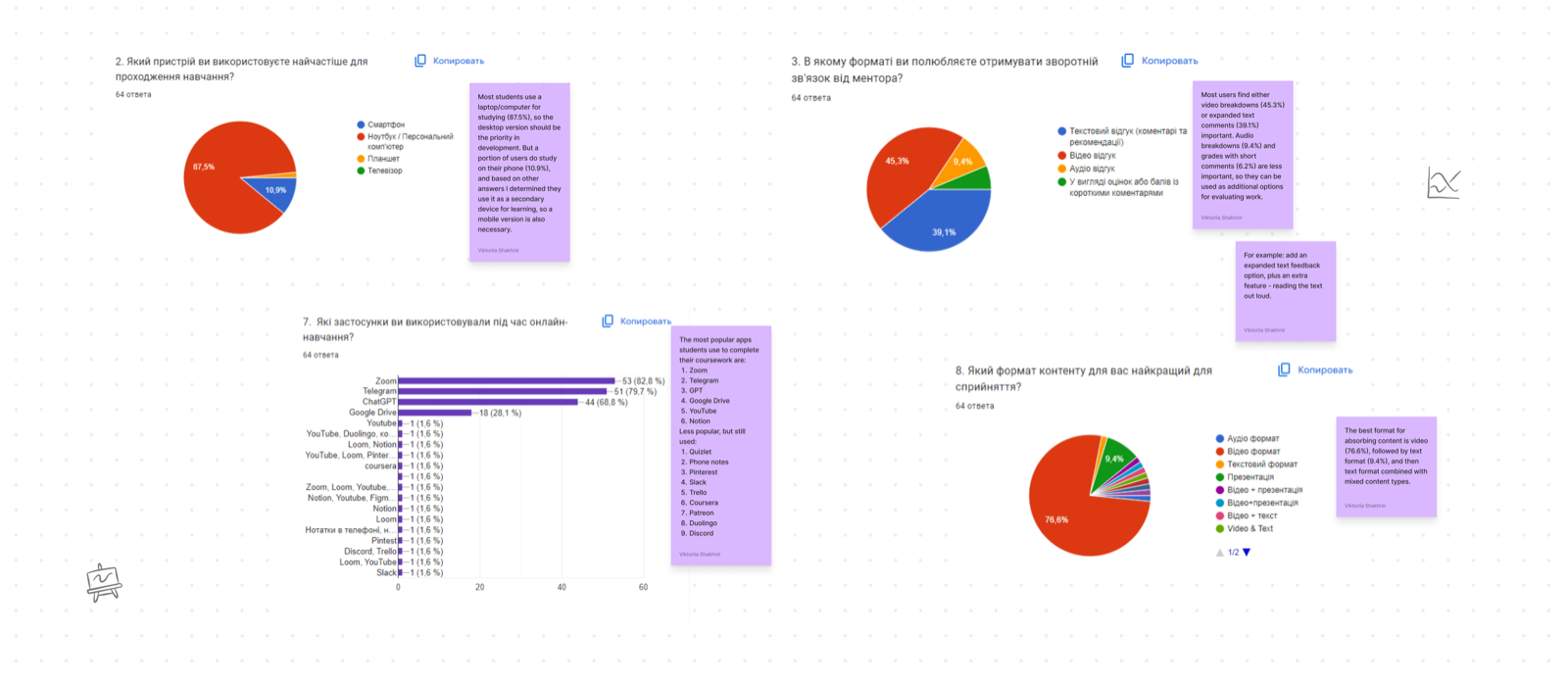
User survey
Goal: collect quantitative data and understand which tools students use while studying.
- Desktop is the priority, but mobile is a useful addition
- Students juggle multiple apps simultaneously: Zoom, Telegram, Notion, YouTube
- Constant switching between tools takes up time and disrupts focus
- Video is the most comfortable format for absorbing learning material
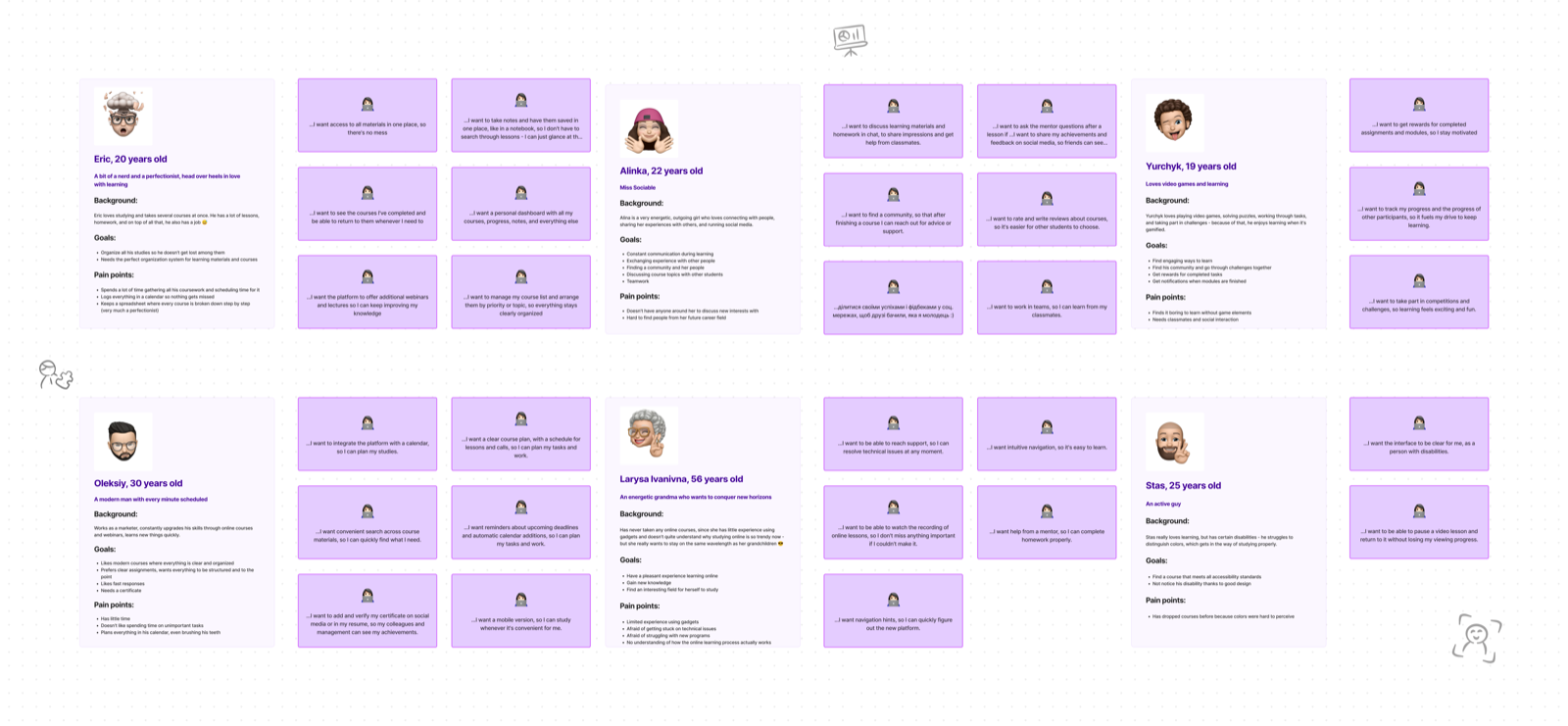
User personas
Goal: structure core needs and define the main user types.
- Some students are experienced with digital tools, others are not
- All need structured materials and an organized learning space
- Help with time management is a shared need: students frequently miss deadlines
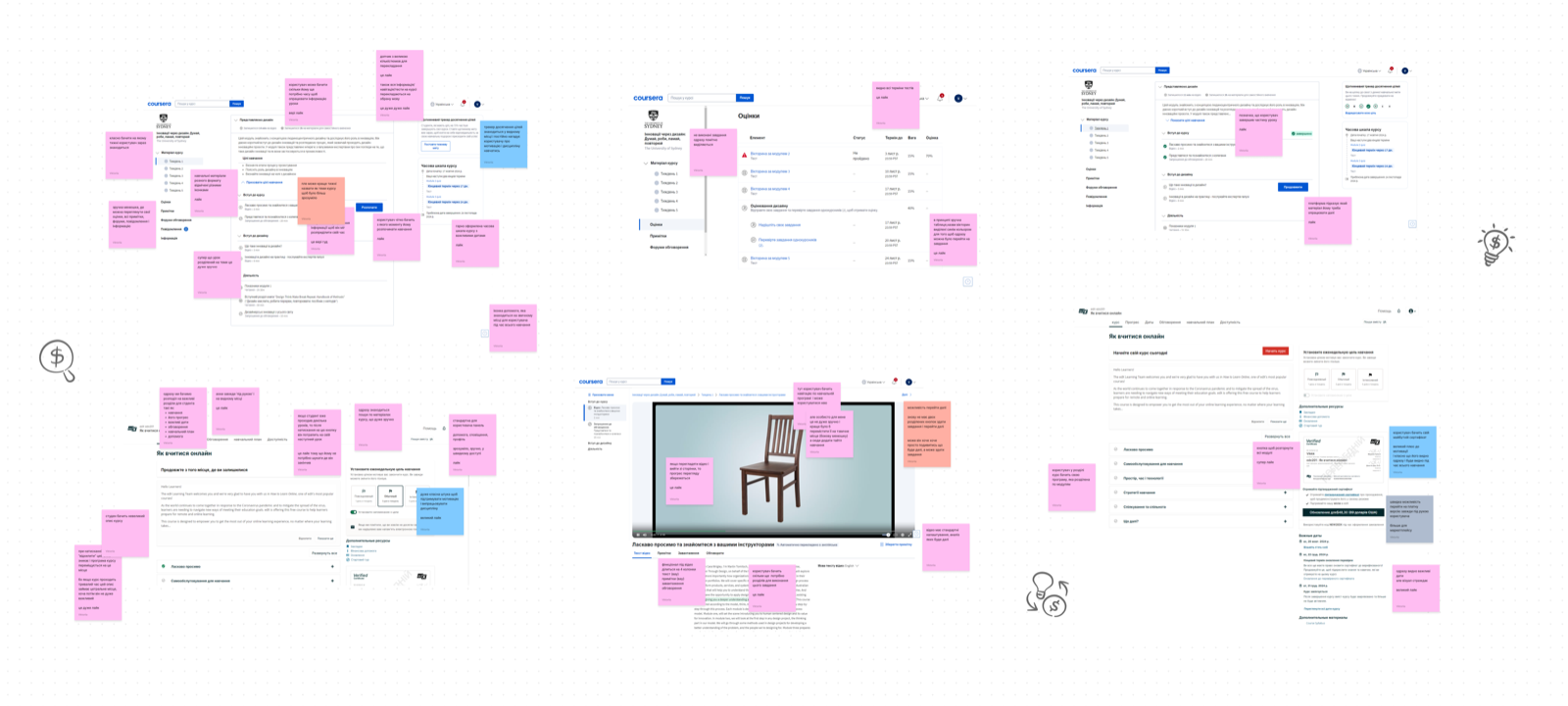
Competitor analysis
Main competitors: Coursera, EdX.
Goal: analyze features, identify strengths and weaknesses, and walk through the full user journey from registration to homework submission.
Coursera:
- Clear course structure: lesson and test dates are visible, as well as assignment completion status
- Students can add notes from transcripts or their own summaries
- The platform offers a chatbot to help resolve technical and learning issues
- No unified dashboard, which makes overall learning management harder for students
EdX:
- Supports integrations with ChatGPT and Google Translate
- After lessons, students can discuss the material with others in a dedicated community space
- Students can set learning goals and track their progress toward them
- The platform design is not modern and needs improvement for easier navigation
Conceptualization
Key screen sketches
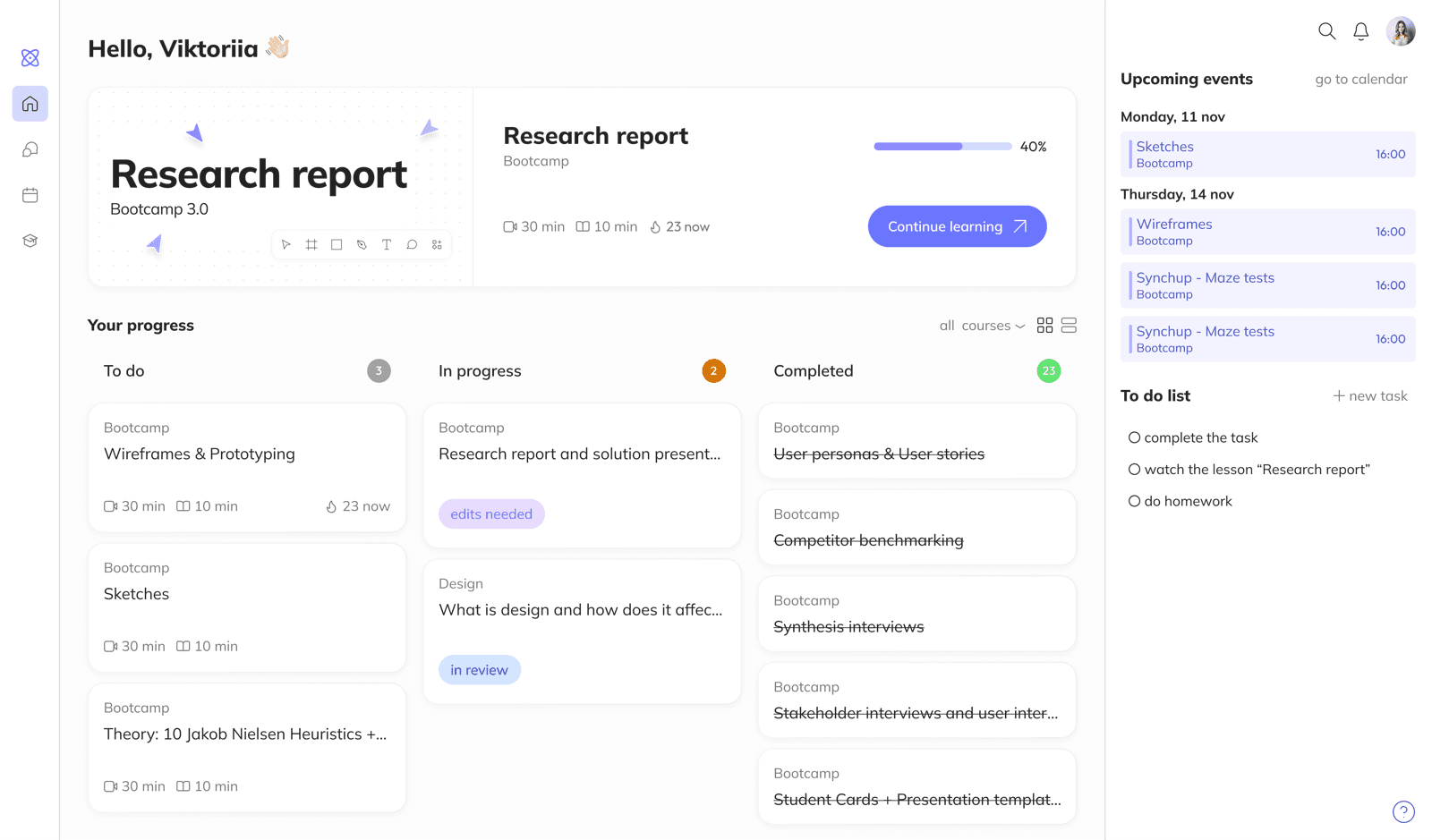
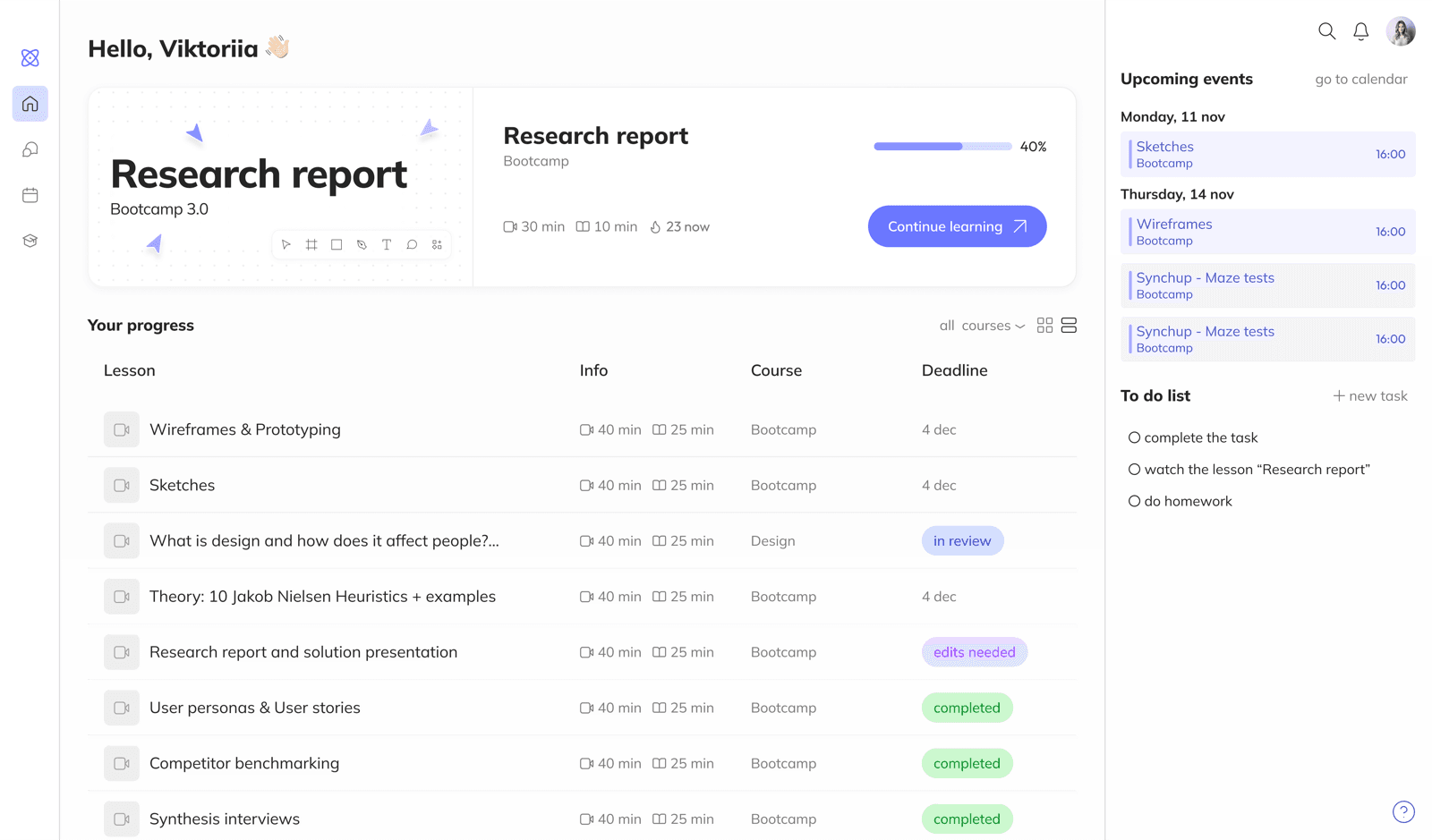
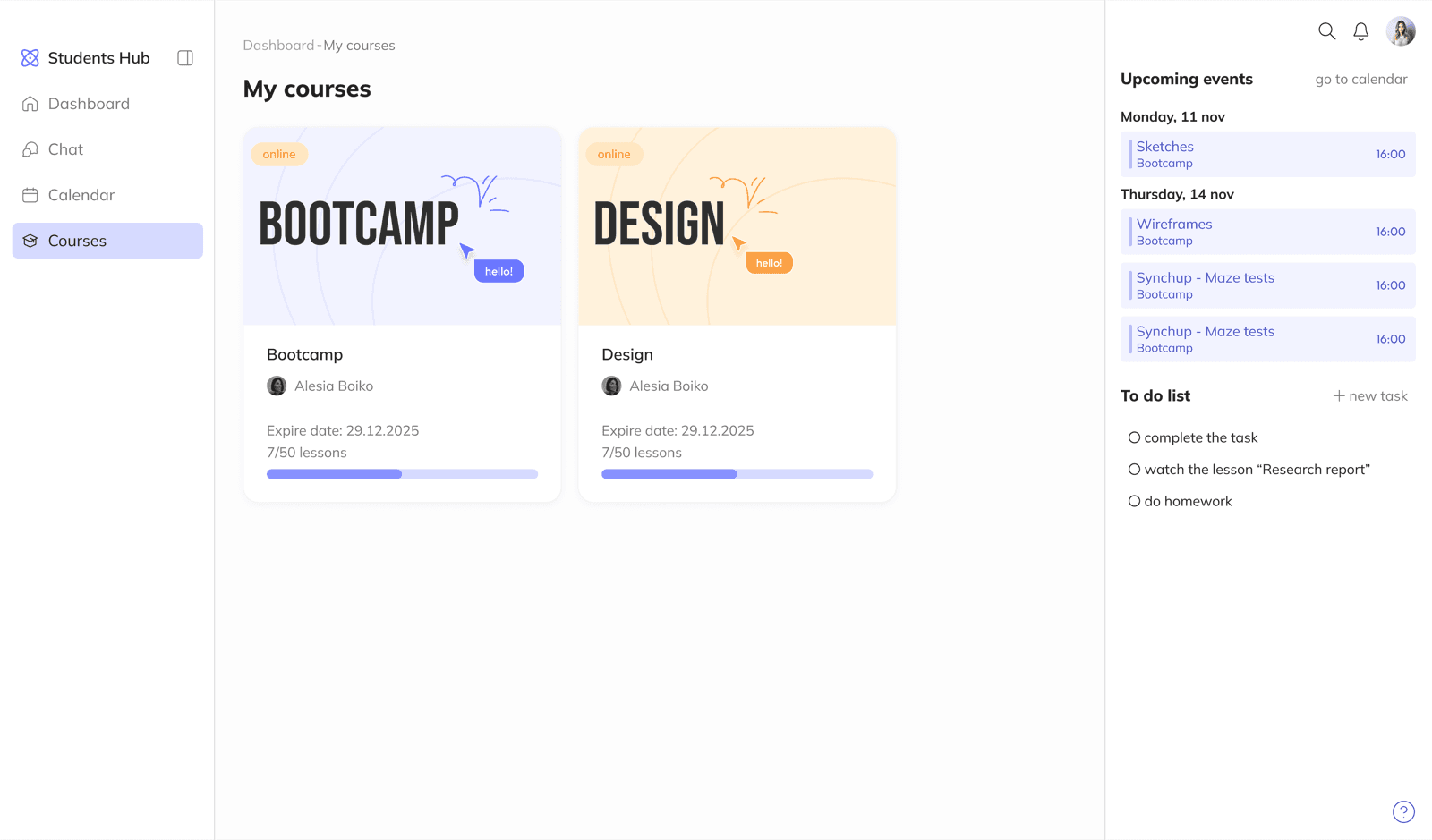
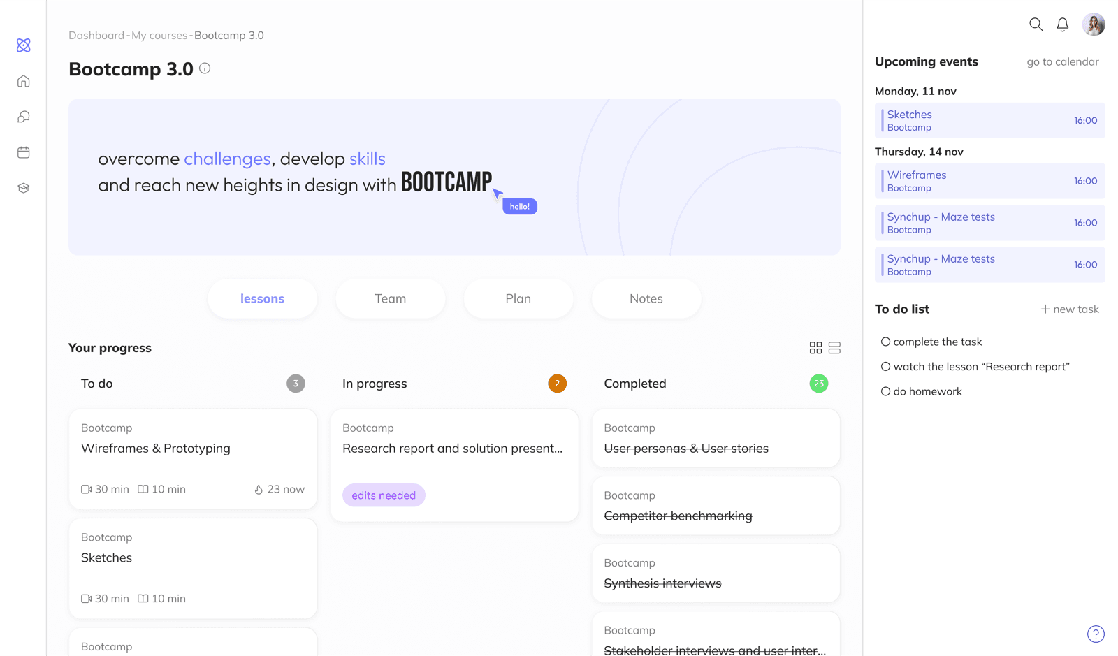
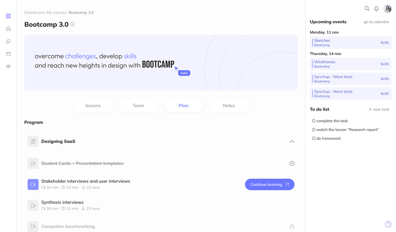
At this stage the focus was on three core screens: dashboard, course page, lesson page. This is where the main feature set took shape and the product's distinctive elements were defined.
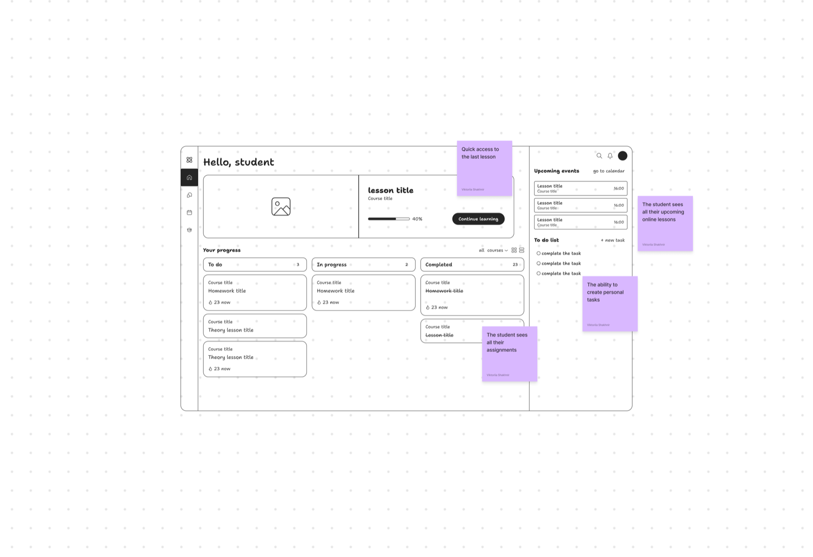
Dashboard needed to be multifunctional: quick return to an unfinished lesson, active assignment overview, upcoming online sessions.
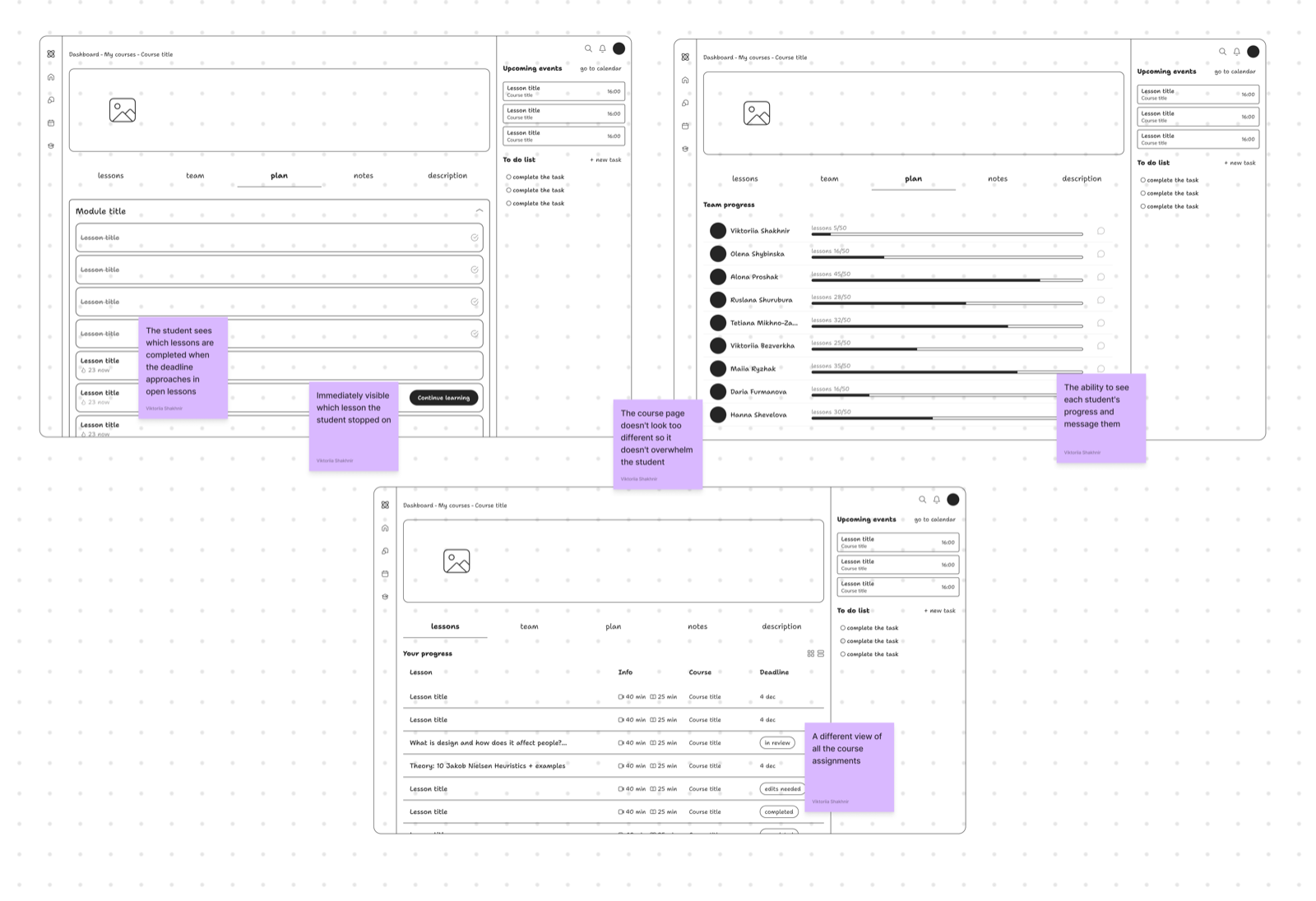
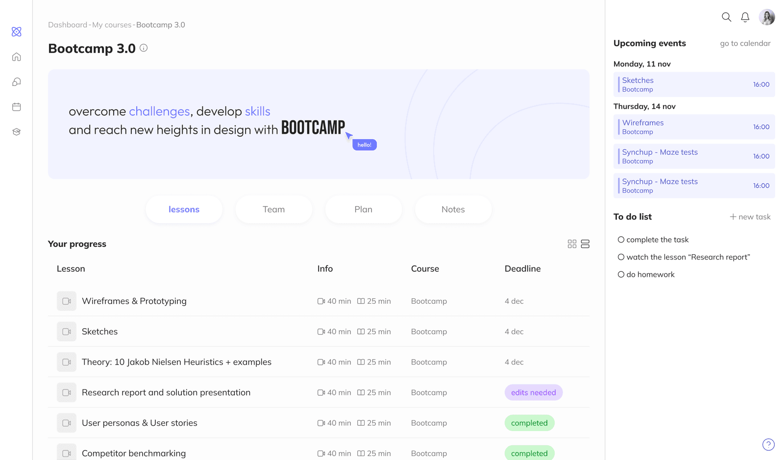
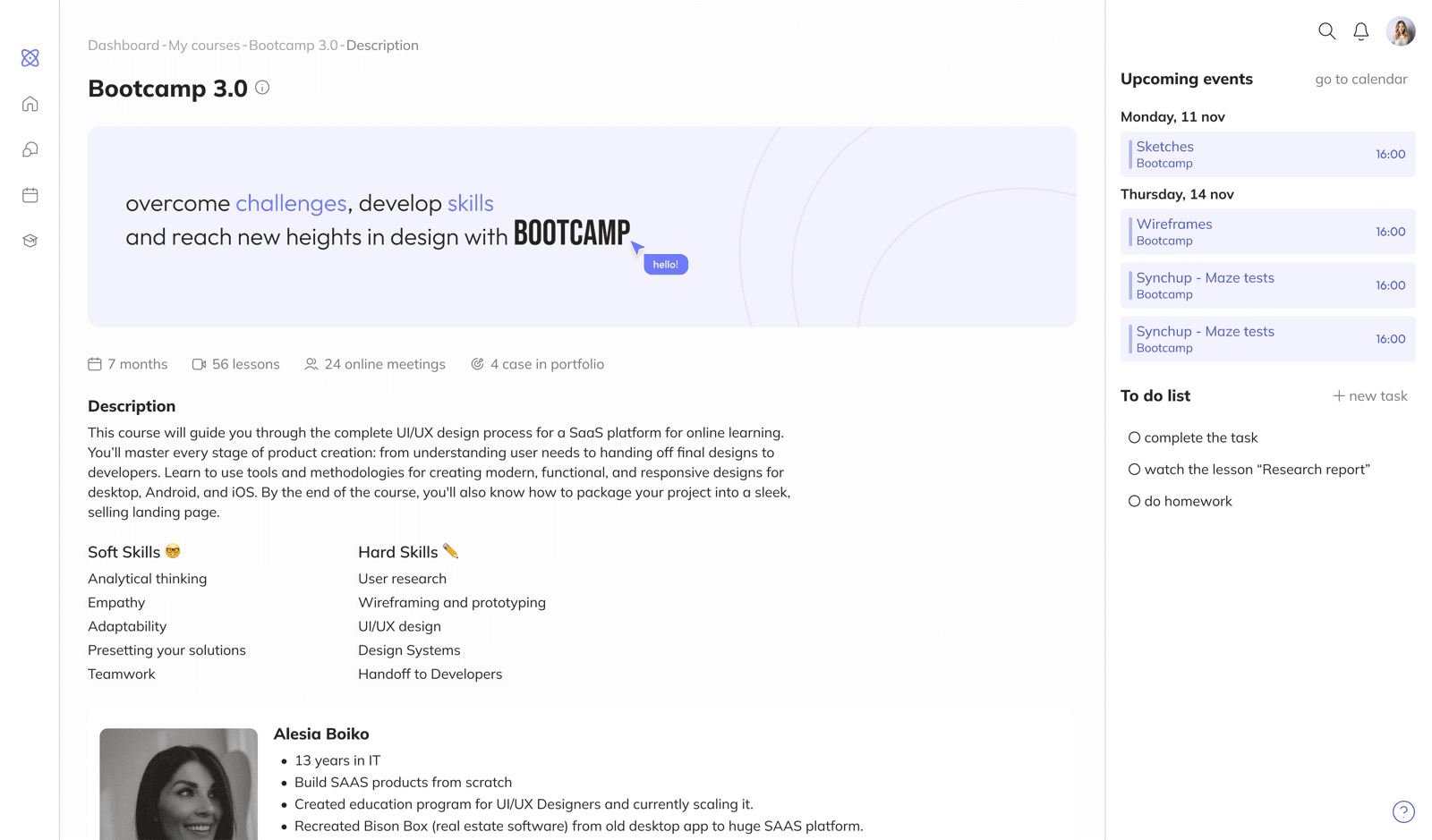
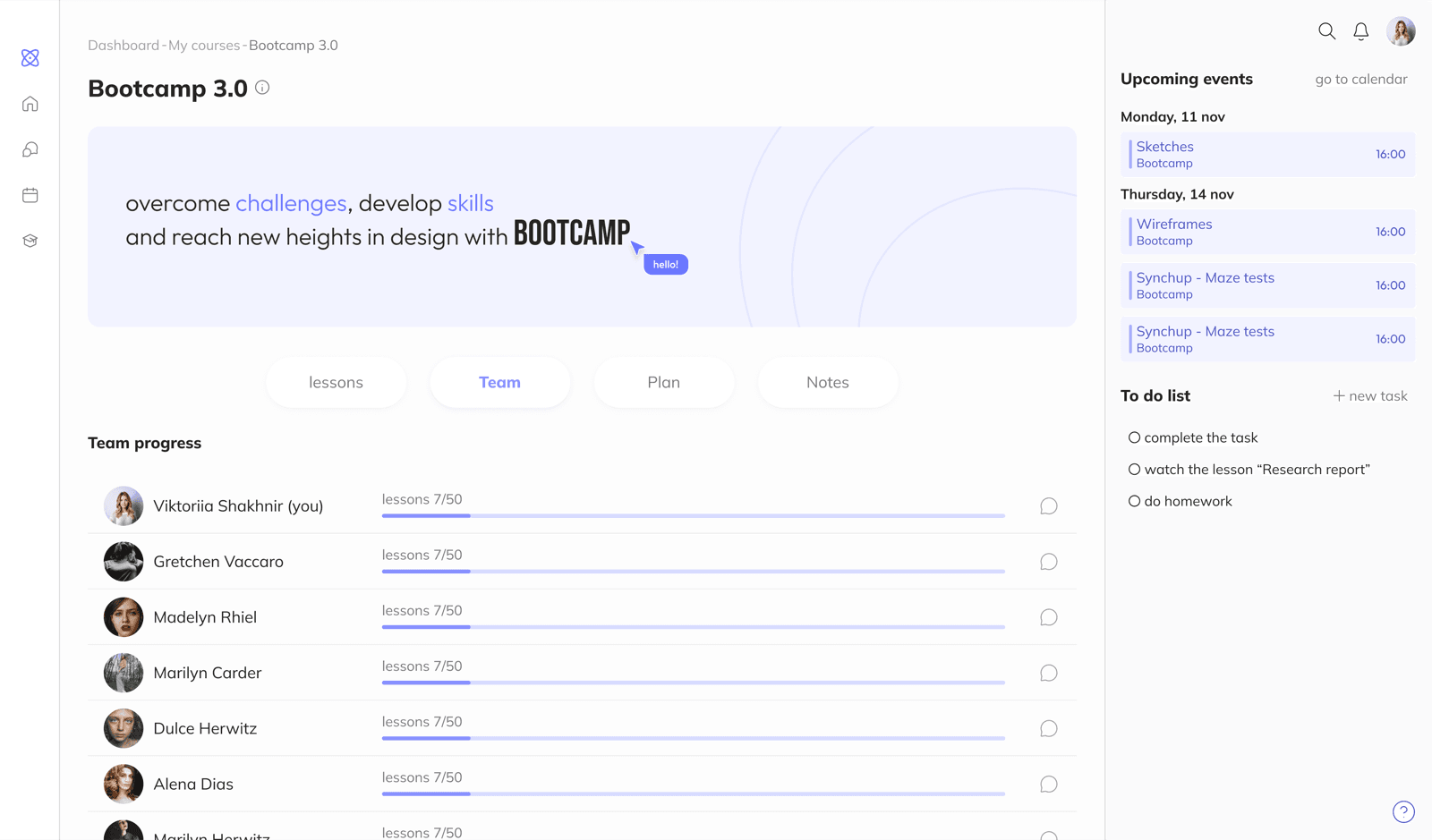
Course page - for navigation and content structure. Information ordered by priority: lessons and assignments first, then the curriculum, student progress, and notes.
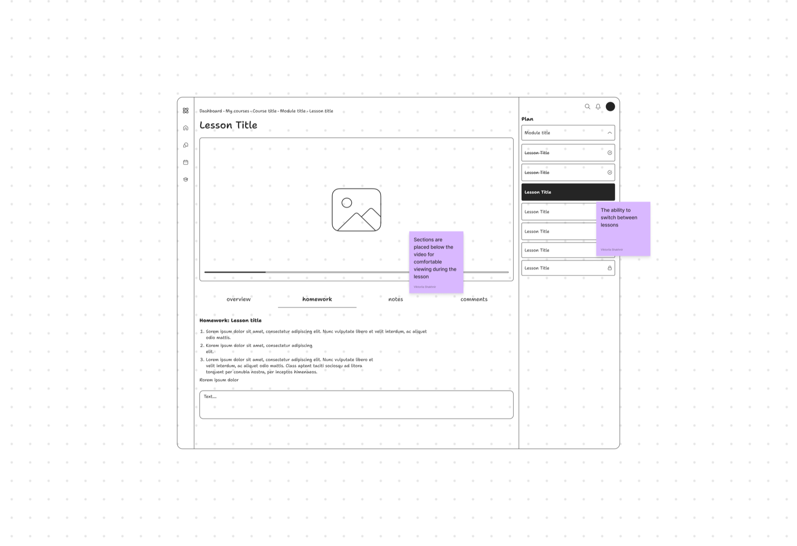
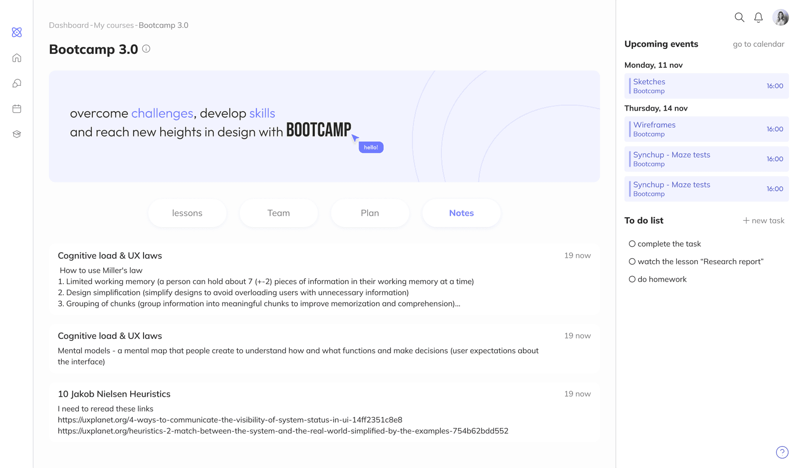
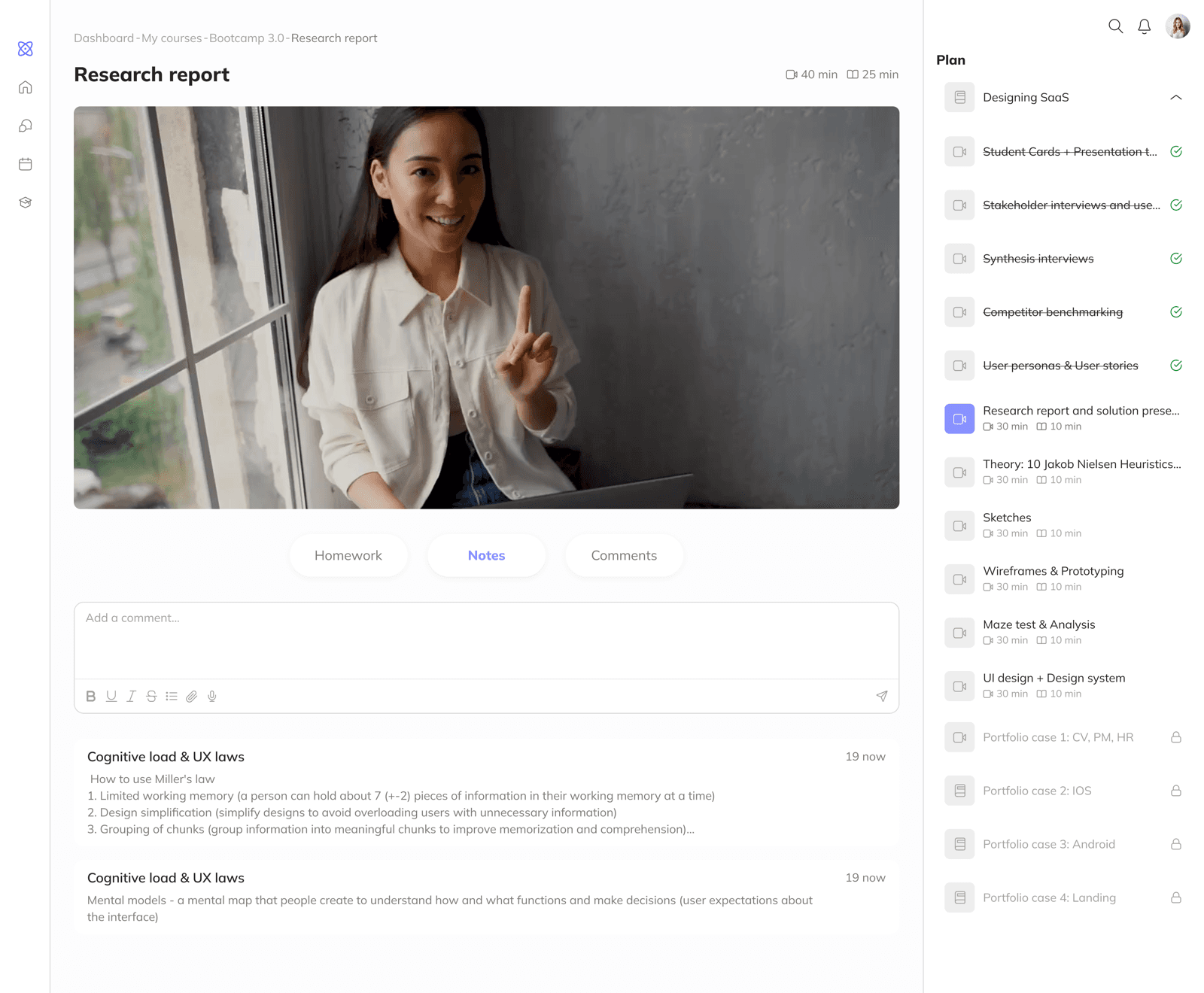
Lesson page - two parts: video and information sections. Assignments and notes available without leaving the video.
Moodboard
Collected references to shape the platform's visual style. The moodboard helped identify approaches that set the platform apart from competitors and gave direction toward a modern, comfortable interface.
Wireframes & Testing
Wireframes
Started with black-and-white wireframes, focusing on structure and interaction logic. Key content - assignments, progress, upcoming events - is immediately accessible without extra steps.
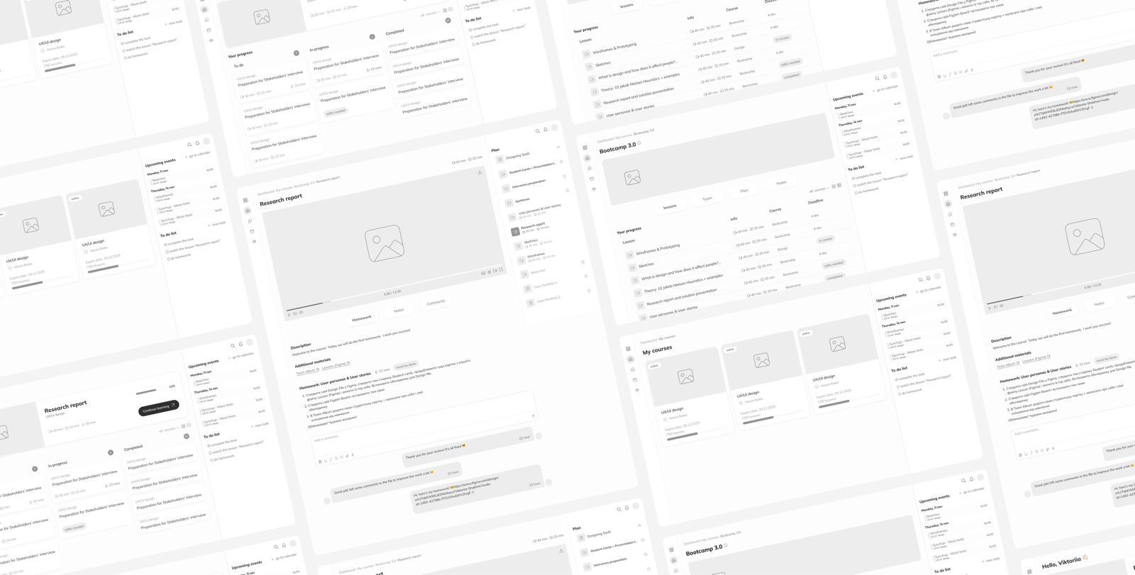
Maze test
Goal: test user behavior across three scenarios: returning to an unfinished lesson, finding notes from a completed course, and locating an incomplete homework assignment.
Results:
- Returning to an unfinished lesson - successful: most students found it quickly
- Finding notes - found, but the path was longer than expected for users unfamiliar with the platform
- Homework - successful: the task board worked without issues
Challenges
A dashboard that covers all needs at once
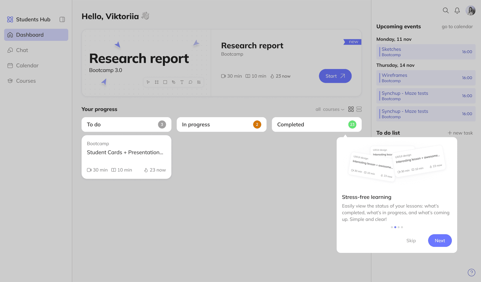
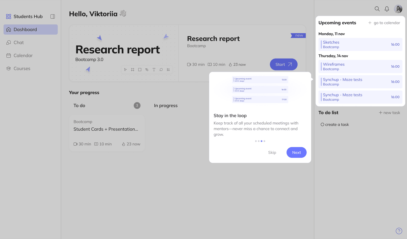
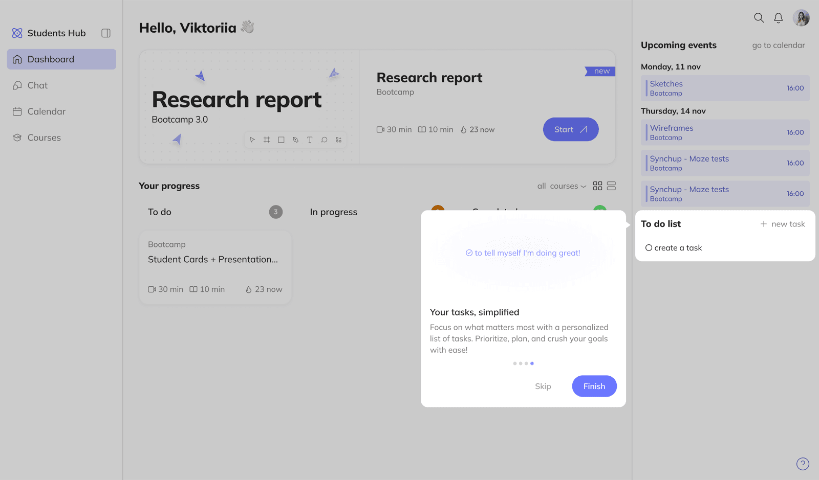
The home screen had to be the entry point for everything: unfinished lesson, active assignments, upcoming sessions. The risk of overload was obvious.
Solution Used research to prioritize what goes where. Most urgent content is prominent and immediately visible. Less time-sensitive content is accessible but doesn't dominate. The dashboard structure maps to a student's actual daily flow.
Navigation across three content levels
The platform has three levels: courses, lessons within a course, and lesson content. Students need to understand where they are and how to get back quickly.
Solution Built clear navigation patterns with breadcrumbs and persistent course structure access. Maze testing showed where navigation needed refinement - and I iterated until the paths felt natural.
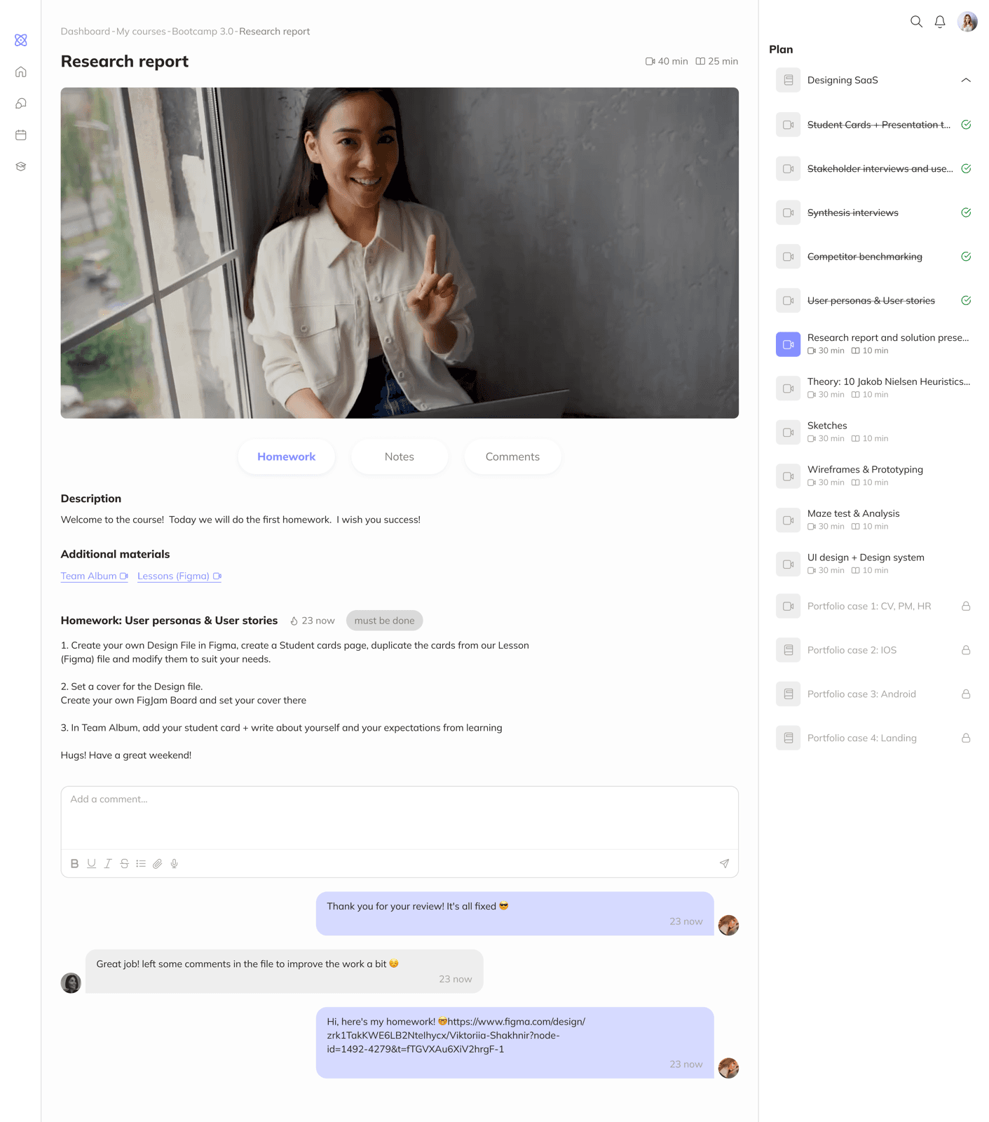
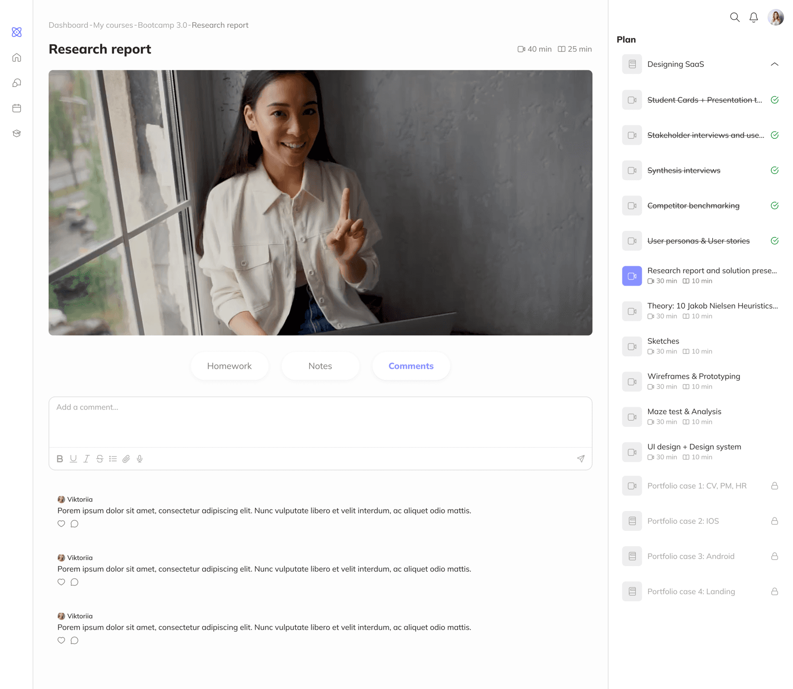
Lesson page: video, homework, and notes at once
Students watch a lesson, complete an assignment, and want to take notes - all at the same time. Three needs, one screen.
Solution The video sits at the top, with tabs below: homework, notes, comments. A lesson switcher is available on the right side. Students finish watching and move straight to the assignment or notes without any extra navigation.
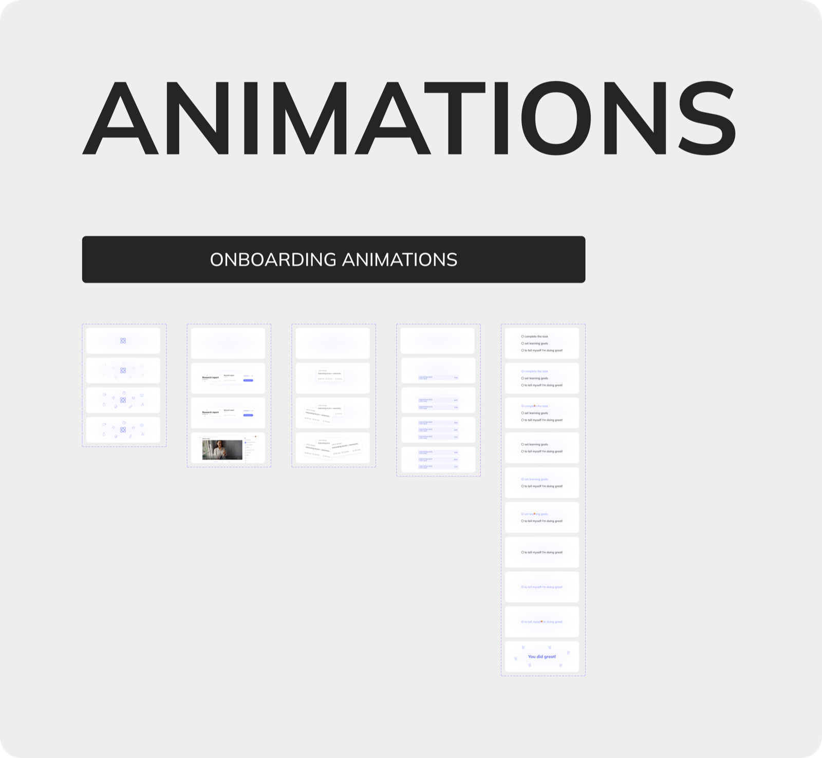
Prototype
The prototype is divided into two paths:
- Active learning: Dashboard, Courses, Course, Lesson
- Start learning: Onboarding, Dashboard-start, Courses-start, Course-start, Lesson-start
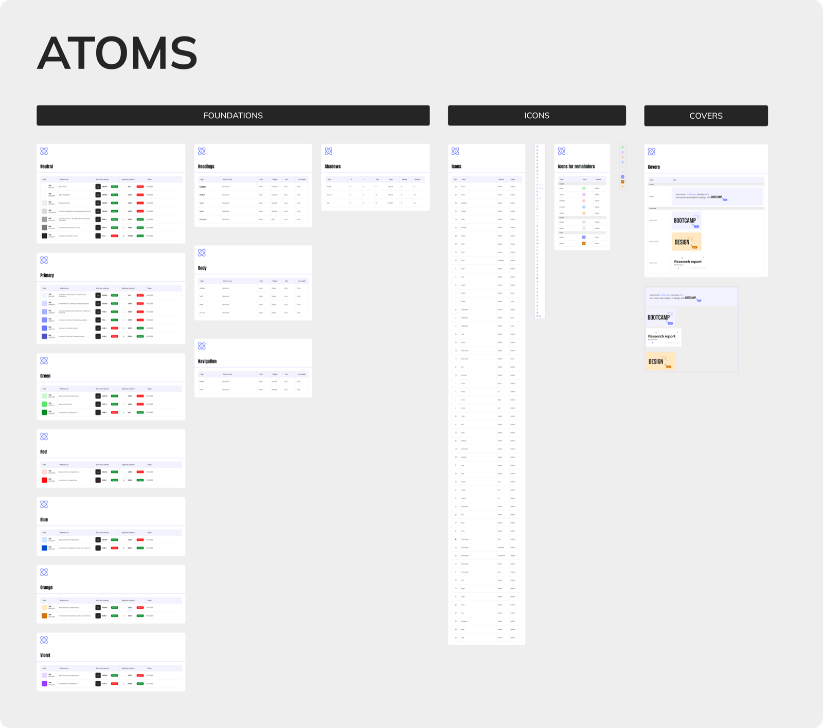
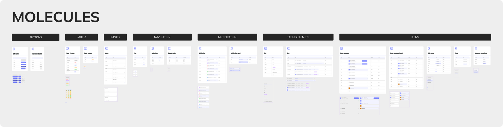
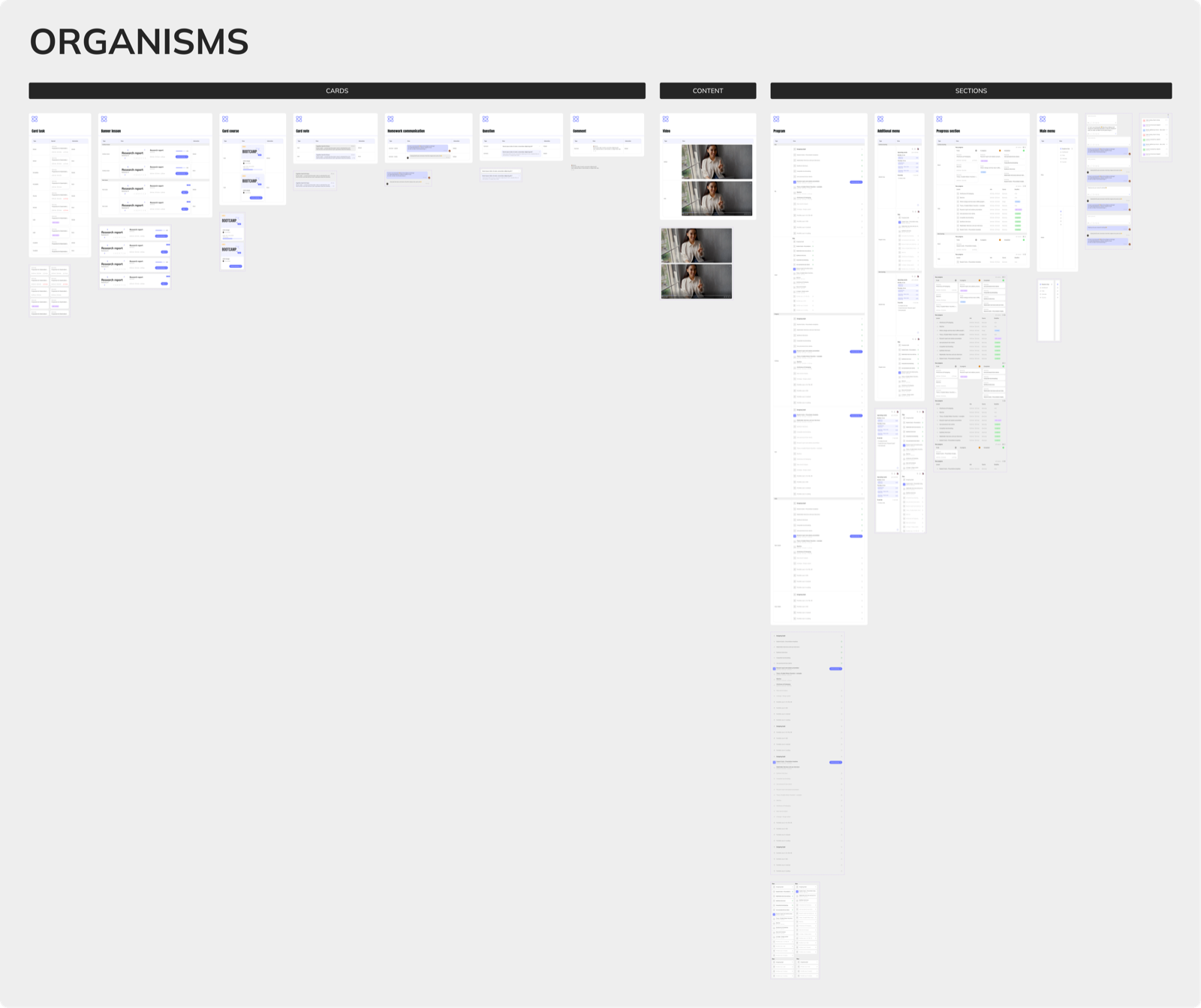
Design System
Built a design system for the web platform: atoms, molecules, organisms, and templates. The system ensures consistent component usage, easy scalability, and visual coherence across the interface.
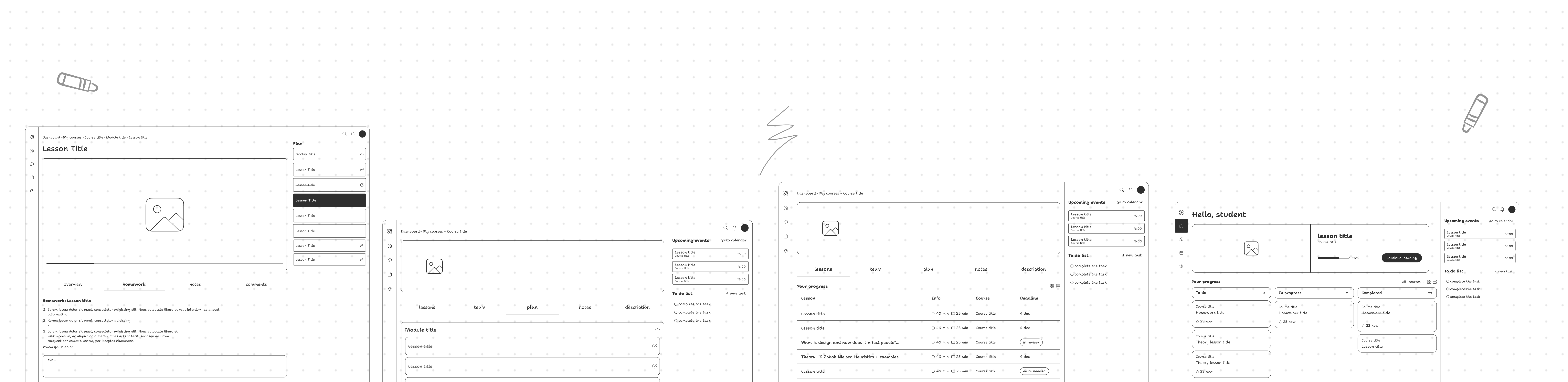
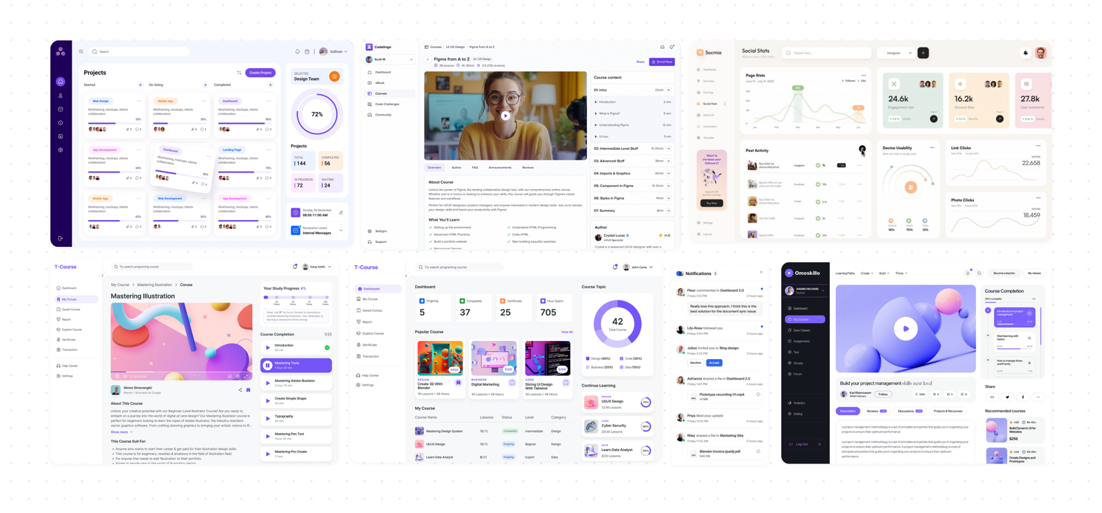
Screens
Outcome
Students Hub is a complete web platform: research, usability testing, design system, and clickable prototype.
For me, this was my first full UX cycle - from interviews with real users to the final design. It showed how research data directly shapes product decisions, and why testing needs to happen before the final UI, not after.